

Skincare Packaging Design: How Premium Brands Use Glass, Color and Droppers to Stand Out
Premium skincare products rarely stand out because of one decorative detail.
Their identity is usually built through a much more deliberate relationship between the formula, the bottle, the colour, the dispensing system and the way all those elements behave together in the consumer’s hand.
This is what makes skincare packaging design such an important part of product development.
A serum may be technologically advanced, highly concentrated or sensorially distinctive, but consumers encounter the packaging before they experience any of those qualities. The weight of the bottle, the way light passes through the glass, the proportions of the closure and even the movement required to dispense the formula already begin to shape expectations.
Premium brands understand this very well.
They use glass not simply because it looks sophisticated, but because different glass constructions create different physical experiences. They use colour to position the formula, rather than treating it as decoration. And they use droppers as both functional and visual elements, turning dosage into part of the skincare ritual.
The strongest packaging therefore does not merely attract attention.
It makes the formula feel understandable before the first application.
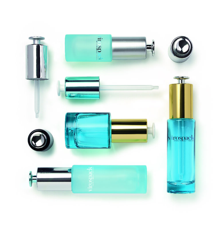
Table of Contents
Premium Skincare Packaging Starts with Coherence
Luxury packaging is sometimes confused with visual complexity.
More decoration, heavier materials, brighter metallic finishes or unusual colours may make a bottle more noticeable, but they do not automatically make it feel more premium.
What usually creates a stronger impression is coherence.
The bottle should feel appropriate for the formula. Its weight should support the product positioning. The closure should have the right visual scale. The colour should reinforce the intended perception of the treatment, and the dispensing gesture should feel natural for the way the formula is supposed to be used.
When these elements reinforce one another, the pack feels resolved.
A technical active serum may look stronger in a precise, restrained bottle than in an excessively decorative one. A sensorial facial oil may benefit from more substantial glass and warmer visual treatment. A high-value treatment may need a closure that makes the application gesture feel more deliberate.
Good skincare packaging design is therefore less about adding premium elements and more about making sure every element is saying the same thing.

Glass Gives the Product Its Physical Character


Glass plays a particularly important role in premium skincare because it influences both visual and tactile perception.
The consumer does not only see the bottle.
They feel its weight, its temperature, its balance and the thickness of the base when they pick it up.
These details shape the perceived value of the product in ways that are difficult to communicate through graphics alone.
However, not every glass bottle creates the same experience.
The distinction between moulded glass bottles and tubular glass bottle a is especially useful when thinking about skincare positioning because the two constructions can create very different design languages.
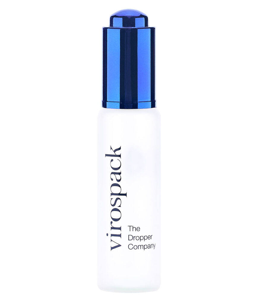
Virospack’s current moulded glass range uses thick glass bases to create greater weight and physical presence, while its tubular glass bottles are characterised by a strong strength-to-weight ratio, excellent transparency and flexibility across dimensions and capacities.
Moulded Glass Creates Presence Through Volume and Weight
Moulded glass works particularly well when the bottle itself needs to become a significant part of the product identity.
A substantial base can visually anchor the pack. Broader proportions can make the product feel more permanent, while thicker glass can create optical depth around the formula and decoration.
For premium skincare, these characteristics can make the product feel more ritualistic.
The user picks up something substantial, opens it, dispenses a small amount and returns the bottle to the vanity. The physical presence of the container becomes part of that repeated interaction.
This does not mean that a heavier bottle is automatically more luxurious. The effect only works when the formula and positioning justify it.
A prestige treatment or sensorial oil may benefit from this sense of substance, whereas an ingredient-led serum positioned around scientific precision may need something visually quieter.
Moulded glass is most effective when its weight reinforces the meaning of the product rather than simply adding mass.

Tubular Glass Creates Luxury Through Precision
Tubular glass offers almost the opposite approach.
Its clean geometry and dimensional consistency allow premium perception to come from precision rather than physical weight.
A tubular bottle can look highly sophisticated without being visually complex. Height, diameter and the relationship between bottle and closure become the primary design tools.
This is especially relevant in contemporary skincare, where many brands increasingly communicate performance through restraint.
A clean vertical bottle can reinforce the idea of concentration.
A compact format can suggest targeted treatment.
A family of bottles sharing the same proportions can create a highly controlled visual system across several formulas.
Virospack’s tubular glass range currently spans multiple small and medium capacities and is highly customizable through decoration processes, while the construction can be adapted to different sizes without requiring dedicated mould investment.
For skincare packaging design, this means tubular glass can provide significant creative flexibility even when the basic architecture remains minimal.
The bottle does not need to shout.
Its proportions do the work.
Shape and Proportion Create Recognition Before Branding Does
Consumers often recognise the silhouette of a skincare bottle before they read the logo, which is why shape and proportion play such an important role in premium skincare packaging design. Before colour, decoration or typography begin to communicate anything, the relationship between height, width, shoulders, base and closure already tells the consumer what kind of product they are looking at and what kind of experience they should expect.
A taller bottle with a more substantial body, for example, tends to create a sense of presence and treatment value. This is visible in Josie Maran Argan Reserve Concentrate, where the bottle combines a relatively elongated format with enough width and a visibly thicker base to feel grounded and premium rather than delicate. The silhouette supports the idea of a richer, more sensorial skincare product, and the proportions give the pack a strong presence even before the metallic finish or branding comes into play.
By contrast, a broader and more compact architecture can make a product feel more accessible, stable and fluid-focused. Biotherm Aquasource Concentrate Serum works in this way. Its body is wider in relation to its height, with softened contours and a generous front surface that gives the formula more visual space. This proportion creates a fresher and more immediate expression, while the narrower upper component keeps the dropper from visually overpowering the bottle. The result is a pack that feels treatment-oriented, but also light, clear and easy to read.
A much slimmer proportion can communicate something else entirely: concentration, precision and targeted use. Fresh Sugar Lip Wonder Drops illustrates this clearly. Its narrow cylindrical body and elongated vertical structure create a very different reading from a classic facial serum bottle. Even before reading the name, the proportions suggest a more specific application area and a more focused type of treatment. The bottle does not need a complex shape to communicate distinction, because its scale and verticality already do that work.


These examples show that recognition often comes less from dramatic form and more from how proportion is handled. A bottle like Josie Maran feels substantial because height is balanced with volume and base weight. Biotherm feels fresh and stable because the body is broader and more compact. Fresh feels precise and targeted because the entire structure is slim and elongated. In each case, the silhouette already creates an expectation before the brand name is even processed.
This also explains why proportion affects every later design decision. The broad front of a bottle such as Biotherm can support more open visual composition and stronger formula visibility, while a narrow format like Fresh naturally pushes the design towards a more vertical reading. A substantial bottle like Josie Maran can carry a more visually present upper component without losing balance, whereas the same component could overwhelm a slimmer format.
In premium skincare packaging, shape establishes the bottle’s architecture, but proportion is what gives that architecture its specific identity.
Droppers Catalogue
Discover our full range of droppers catalogue
Color Is One of the Fastest Ways to Position a Skincare Formula
Colour often communicates the character of a skincare product before any claim is read.
It can make the formula feel clinical, botanical, sensorial, protective, energetic or luxurious almost instantly.
This is particularly powerful in glass packaging because colour can behave in several different ways.
It may be part of the glass itself.
It can be introduced through a translucent finish that allows the formula to remain partially visible.
It can become opaque, transforming the bottle into a solid branding surface.
Or it can move across the bottle as a gradient, using the shape itself as part of the visual effect.
The choice should not begin with the question, Which colour looks premium?
It should begin with, What should this formula feel like?
A hydration-oriented product may benefit from a visual language built around clarity and freshness. An intensive night treatment may need more depth. Botanical positioning may call for warmer or more organic tones, while a highly technical serum may work better with restrained colour and controlled contrast.
The strongest colour decisions are the ones that feel inseparable from the product.
When consumers eventually recognise the shade before reading the name, colour has moved from decoration into brand identity.


Clear Glass Makes the Formula Part of the Design
Clear glass gives the formula an active role in the packaging design.
Instead of hiding the product behind colour or opacity, the bottle allows the consumer to see the liquid directly, which means the formula itself becomes part of the visual composition. Its colour, clarity, texture and even the changing fill level contribute to the overall appearance of the pack.
This can be particularly effective when the product has a clean, refined or technically precise positioning.
Goldwell Kerasilk Reconstruct is a good example. Its transparent bottle leaves the formula completely visible, while the decoration remains restrained and the metallic upper component provides most of the visual contrast. The glass does not compete with the product inside; it frames it. The result feels clean, controlled and professional, which is especially coherent for a treatment positioned around hair repair and performance.
The transparency also changes the hierarchy of the packaging. Because the bottle itself remains visually quiet, the eye moves naturally between the formula, the printed information and the metallic closure. None of these elements has to dominate excessively for the pack to feel distinctive.
This is one of the strengths of clear glass in skincare packaging design and treatment packaging more broadly. When the formula has an appearance worth showing, transparency can reduce the need for heavier decoration and allow the product itself to carry part of the brand message.
However, clear glass should always be an intentional choice rather than a neutral default.
When the formula is visually attractive and its exposure is compatible with the packaging requirements, transparency can create a stronger connection between product and consumer.
In that case, the formula is no longer simply contained by the bottle.
It becomes part of the design.
Frosted and Translucent Finishes Create Controlled Visibility
Not every product needs complete transparency.
Frosted and translucent treatments allow the formula to remain visible while changing how directly it is perceived.
Instead of sharp reflections and complete visual exposure, light becomes diffused across the surface. Colour feels softer, the formula becomes less literal and the bottle can take on a more refined or sensorial character.
This is especially useful when a brand wants consumers to maintain some visual relationship with the serum without making the liquid the dominant design element.
The bottle becomes a filter.
The formula remains present, but its appearance is curated.
In premium skincare, that distinction can be valuable because it allows the product to feel softer and more sophisticated without relying on excessive decoration.


Opaque Color Turns the Bottle into a Brand Asset
When formula visibility is less important, opaque colour allows the bottle itself to carry much more of the visual identity.
A relatively simple glass structure can become distinctive through a tightly controlled colour system.
This can be especially effective across product families.
Different formulas may share the same bottle architecture but use related tones to differentiate treatments, while typography and closure design remain consistent.
The result feels systematic rather than repetitive.
Opaque finishes can also strengthen visual presence online, where bottle silhouette and colour often need to communicate the product before consumers can experience weight or texture physically.
For premium brands, colour therefore becomes more than shelf decoration.
It can create continuity across physical retail, e-commerce, social imagery and the broader visual language of a skincare range.
Gradients Add Depth Without Changing the Bottle Structure
Gradients are one of the most effective ways to give a skincare bottle more visual depth without altering its physical structure.
A bottle may keep a relatively simple architecture, but once colour begins to transition across the glass, the pack can communicate much more. A darker base can visually anchor the bottle, making it feel more stable and substantial. A transition towards transparency can reduce visual heaviness and allow the formula to remain partially visible. In other cases, the gradient can suggest concentration, radiance or sensorial richness, depending on how the colour is distributed and how strongly it contrasts with the rest of the pack.
This is particularly clear in Kérastase K Genesis Sérum Anti-Chute Fortifiant, where the red tone intensifies towards the base and fades upwards into clearer glass. The bottle structure itself remains clean and relatively straightforward, but the gradient gives it far more energy and presence. It also creates a sense of downward visual weight, which helps the bottle feel grounded while making the formula appear more active and concentrated.
A different effect appears in Kérastase K Spécifique Potentialiste. Here, the green gradient brings freshness and technical clarity, but because the tone remains more fluid and aqueous in character, the result feels less intense than the Genesis bottle and more linked to balance, freshness and scalp care. The bottle shape does not need to change for the identity to shift dramatically; the gradient itself does much of that work.


With Lancôme Absolue Precious Oil, the gradient is softer and more luxurious in tone. The transition between the more opaque golden upper body and the clearer lower section creates a more refined and luminous effect. Rather than communicating freshness or technical concentration, the colour treatment supports a richer, more precious perception, which is especially coherent for an oil-based formula positioned around nourishment and radiance. The bottle feels elevated not because its silhouette is complex, but because the colour transition gives the glass a more sophisticated visual rhythm.
La Mer Genaissance Serum Essence shows another reason gradients are so valuable in premium packaging. Its rounded, sculptural bottle already has strong physical character, yet the warm amber concentration at the base adds even more depth to the object. The gradient helps the bottle feel richer and more dimensional, while the clearer upper area preserves softness and lightness around the shoulders. In this case, the effect is not only decorative; it reinforces the luxury of the form itself by making the glass appear deeper and more atmospheric.
These examples show that gradients can perform several functions at once. They can add visual weight, as in Kérastase Genesis; create a fresher and more fluid treatment identity, as in Kérastase Potentialiste; reinforce radiance and preciousness, as in Lancôme Absolue Precious Oil; or enhance sculptural luxury, as in La Mer Genaissance Serum Essence.
That is why gradients are so useful in skincare packaging design. They allow brands to transform a relatively simple bottle into something far more expressive without changing the underlying structure. When used well, the gradient does not compete with the bottle architecture. It enhances it by guiding the eye, shaping visual balance and giving the pack a stronger sense of depth.
The Dropper Is Part of the Visual Identity
Droppers are often discussed primarily in terms of dosage, but in premium skincare they also have a major influence on bottle design.
The upper component can represent a significant proportion of the overall package.
Its diameter, height, material, colour and finish can either extend the architecture of the bottle or deliberately contrast with it.
This means that choosing a dropper only after the glass bottle has been finalized can create visual problems.
A narrow closure on a very substantial bottle may feel weak.
An oversized dropper can overwhelm a slim bottle.
A metallic upper component can add sophistication, but it can also become too dominant if the glass already carries a strong finish.
Virospack’s current standard dropper range includes multiple shapes, sizes, materials, finishes and dosage options for serums and other fluid cosmetic formulations, alongside decoration techniques such as screen printing, hot stamping, painting and metallization.
The dropper therefore needs to be treated as part of the bottle architecture from the beginning.
It is not simply the mechanism placed on top.
Standard Droppers Support a More Familiar Skincare Ritual
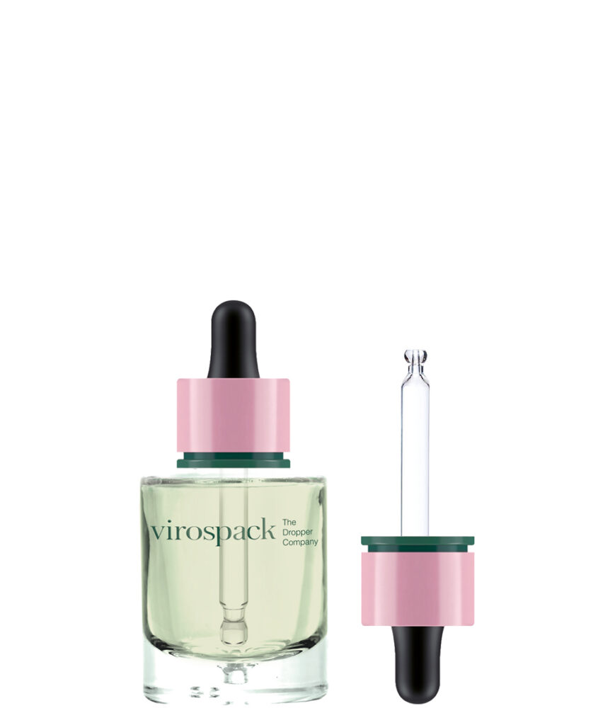
A standard dropper remains one of the most recognisable gestures in serum and oil packaging.
The consumer compresses the bulb, draws the formula and releases the amount required.
That gesture is familiar, flexible and strongly associated with concentrated skincare.
From a design perspective, standard droppers can create different identities depending on how the upper component is treated.
A dark bulb and understated collar may feel clinical.
A metallic finish can move the bottle towards prestige.
A coloured closure can connect the dispensing system more closely to the rest of the brand palette.
Because the mechanism is familiar, brands have considerable freedom to change its visual character without making the product difficult to understand.
This is one of the strengths of standard droppers in premium skincare packaging design.
They combine functional familiarity with significant customization potential.
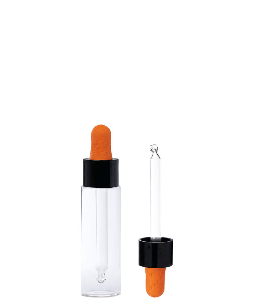

Push Button Droppers Make Precision Visible
Push button droppers communicate something different.
Their defining feature is not simply that they dispense serum, but that the dispensing gesture appears more engineered.
The actuator becomes visible evidence that the product has been designed around control.
This can be particularly effective for high-performance skincare, where precision forms part of the broader brand language.
A push button system can make even a familiar bottle architecture feel more technical because the consumer immediately understands that the application gesture is different from a traditional bulb dropper.
The benefit is therefore both functional and visual.
Precision is not hidden inside the mechanism.
It becomes part of the pack’s identity.
This is why push button systems work particularly well when the formula itself is positioned around advanced treatment, controlled application or innovation.
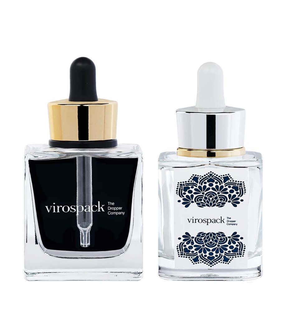
Magnetic Droppers Add Luxury Through Interaction
Some aspects of premium packaging cannot be communicated fully in photography.
Magnetic closure is one of them.
A bottle may appear elegant on a shelf, but its perceived quality increases when the opening and closing movement feels controlled and satisfying.
Virospack’s catalogue currently includes magnetic droppers alongside standard and push button systems.
Their design value comes from turning closure into part of the skincare ritual.
The consumer feels the upper component align and return to position, adding a layer of tactile precision that conventional visual decoration cannot reproduce.
This is particularly relevant in prestige skincare, where a significant part of luxury perception comes from repeated interaction with the pack.
A magnetic system should therefore not be viewed merely as an upgraded closure.
When used coherently, it becomes another design language: luxury expressed through movement rather than ornament.
Metallic Elements Work Best When They Create Hierarchy

Metallic details have long been associated with premium beauty, but their effectiveness depends heavily on how much visual weight they are given.
A metallic closure can provide contrast against transparent or coloured glass.
A small hot-stamped detail can direct attention towards a logo.
Metallization can transform an entire component into a more reflective, object-like surface.
Used selectively, these treatments create hierarchy.
Used everywhere, they can flatten it.
Premium skincare packaging often feels more sophisticated when reflective elements are balanced against quieter surfaces. A metallic upper component becomes more noticeable against matte or translucent glass precisely because the bottle does not compete with it.
Virospack offers decoration and finishing capabilities including screen printing, hot stamping, painting and metallization across its packaging solutions.
The strategic question is therefore not whether metallic decoration looks luxurious.
It is where metallic contrast should appear so that it strengthens the pack rather than overwhelming it.
Decoration Should Reinforce What the Bottle Already Says
Decoration works best when it builds on decisions that have already been made through glass, colour and proportion.
- Screen printing can integrate typography directly into the bottle without covering the surface with an additional visual layer.
- Hot stamping can introduce focused metallic contrast.
- Painting can change the entire chromatic identity of the glass.
- Metallization can transform selected components much more dramatically.
None of these techniques should have to rescue an unresolved bottle design.
If the shape, colour and closure already communicate the product clearly, decoration can remain precise and restrained.
This is often where premium skincare distinguishes itself from packaging designed primarily for immediate attention.
The objective is not to occupy every available surface.
It is to control what the consumer notices first, second and third.
A well-designed bottle has visual hierarchy.
- The brand name does not compete with the colour.
- The dropper does not fight the bottle.
- The finish does not hide the architecture.
Everything contributes to one reading of the product.
Luxury Can Come from Restraint or from Presence

There is no single aesthetic formula for premium skincare.
Some brands create luxury through substantial moulded glass, thicker bases and a strong physical presence.
Others use slim tubular bottles, limited typography and extremely precise proportions.
One approach makes the product feel more object-like.
The other makes it feel more controlled and technical.
Both can be highly effective because premium perception depends less on the amount of design and more on the quality of the decisions.
A restrained bottle is not automatically minimal.
A substantial bottle is not automatically luxurious.
What matters is whether the packaging reflects the formula and brand convincingly.
This is why a high-performance serum may feel more premium in a clean tubular glass bottle than in an unnecessarily heavy pack, while a prestige oil may benefit from the tactile presence of moulded glass.
Luxury is contextual.
Skincare Packaging Must Work from Every Angle
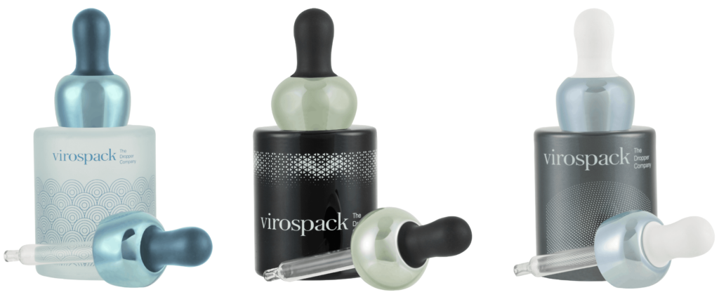
Packaging is increasingly experienced through more than the physical shelf.
Consumers encounter skincare in product photography, e-commerce listings, social media, unboxing content and bathroom environments.
A bottle therefore needs to retain its identity in multiple contexts.
Colour becomes particularly important online because tactile cues such as weight cannot be communicated directly.
Shape helps the product remain recognisable even at relatively small image sizes.
Metallic contrasts can create visual highlights.
Gradients and transparency can give the bottle depth under photography.
At the same time, the physical experience still needs to deliver what those images promise.
A bottle that looks substantial online but feels unexpectedly light in the hand creates a disconnect.
A closure that appears precise but feels weak reduces confidence.
Premium skincare packaging design has to survive the transition from image to object.
The visual promise and physical experience should reinforce one another.
The Formula Should Still Lead the Design
Even highly expressive skincare packaging should ultimately remain connected to the formula.
This is especially important because design trends can encourage brands to make aesthetic decisions before technical requirements are fully understood.
A clear bottle may look ideal but make little sense if the formula requires another light-management strategy.
A highly decorative finish may obscure a formula whose natural colour could have been a major visual asset.
A push button dropper may communicate precision but add unnecessary complexity to a product whose consumer benefits more from flexible dosage.
A substantial moulded bottle may feel luxurious but contradict a lightweight, clinical product identity.
The strongest brands avoid this disconnect by allowing formulation, application and positioning to inform the visual language together.
Packaging does not sit on top of the product strategy.
It expresses it.
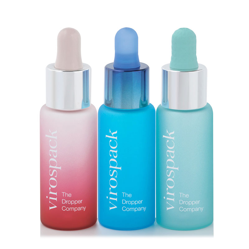
What Makes Premium Skincare Packaging Stand Out?
Premium packaging stands out when it feels specific rather than generic.
Consumers should be able to sense that the bottle belongs to the formula inside and to the brand behind it.
Glass provides the physical foundation.
Shape and proportion create recognisable architecture.
Colour determines much of the emotional territory.
Transparency or opacity controls how the consumer encounters the formula.
The dropper shapes both the visual composition and the application gesture.
Decoration adds the final layer of identity.
None of these decisions needs to be dramatic on its own.
Their strength comes from working together.
That is why the most successful premium bottles often appear simpler than they really are. The complexity exists in the decisions, not necessarily in the final appearance.
A bottle may use relatively restrained geometry, a carefully controlled colour and a refined dropper, yet feel far more distinctive than packaging filled with decorative elements.
The difference is intention.

How to Approach Skincare Packaging Design

For brands developing premium skincare packaging, the process works best when visual decisions follow a clear hierarchy.
The formula should first establish the technical boundaries: texture, sensitivity, dosage and intended use.
The bottle architecture can then be chosen according to the desired physical experience, whether that means the greater presence of moulded glass or the dimensional precision of tubular glass.
Colour and finish should determine how much of the formula remains visible and what emotional territory the product occupies.
The dropper should be selected not only for dispensing performance but also for how its proportions and gesture affect the complete pack.
Decoration comes last, reinforcing a visual identity that should already be understandable before a logo is added.
When these decisions are made in isolation, packaging often looks assembled.
When they are developed together, it feels designed.
That difference is at the heart of premium skincare packaging design.
Frequently Asked Questions About Skincare Packaging Design
What makes skincare packaging look premium?
Premium skincare packaging usually combines coherent materials, balanced proportions, carefully controlled colour, refined finishes and a dispensing system that fits both the formula and the visual identity. Luxury does not depend on decoration alone; the complete pack needs to feel intentional.
Why is glass commonly used in premium skincare packaging design?
Glass provides material presence, optical clarity and significant possibilities for colour and decoration. Moulded glass can create greater weight and physical presence, while tubular glass can support a cleaner, more precise and restrained design language.
How does color influence skincare packaging design?
Colour influences how consumers interpret the product before use. Transparent, translucent, opaque, dark and gradient treatments can communicate very different ideas, from purity and freshness to protection, treatment intensity or luxury.
Why are droppers important in serum packaging design?
Droppers affect both dosage and the visual composition of the bottle. Their height, diameter, material and finish influence the overall proportions of the pack, while standard, push button or magnetic systems can create very different application experiences.
What is the difference between standard and push button droppers?
Standard droppers offer a familiar and flexible manual dispensing gesture, while push button droppers create a more defined and technical interaction. The appropriate choice depends on the formula, dosage requirements and the brand experience the packaging is intended to communicate.
Should premium skincare packaging always be highly customized?
No. Strong skincare packaging can come from relatively simple bottle architectures when proportion, colour, finish and closure are carefully controlled. Customization is most effective when it creates recognition and coherence rather than complexity for its own sake.