

Serum Bottle Packaging Guide: How to Choose the Right Bottle, Dropper and Finish for Your Formula
Choosing the right serum bottle packaging starts with understanding the formula, because a serum bottle should never be treated as an isolated design object. Its shape, capacity, dropper, finish and decoration all influence how the product behaves, how it is applied and how consumers interpret its value.
This becomes especially important because the word serum now covers an extremely broad range of formulations. Some serums are almost water-like, others behave more like lightweight oils, while richer gel-serums and intensive treatments can have considerably more body. Their active ingredients may also introduce different requirements around light exposure, stability, dosage or application frequency.
As a result, there is no universal serum bottle that works equally well for every formula. A successful packaging system is built by matching the physical behaviour of the serum with the right glass construction, dispensing system and visual treatment.
The goal is not simply to find an attractive bottle. It is to create packaging that feels as though it was developed specifically for the formula inside.

Table of Contents
Start with the Serum, Not the Bottle
Serum packaging development should begin with the behaviour of the formula rather than with a preferred bottle shape.
Two serums can belong to the same skincare category and still demand completely different packaging. A lightweight hydrating serum may move rapidly through a dropper and be applied relatively generously, whereas a concentrated oil-serum may require slower, more controlled dispensing. A gel-serum may have enough viscosity to make a conventional dropper inconvenient, while an antioxidant treatment may introduce additional considerations around light exposure and formula stability.
These differences should guide the packaging decision from the beginning.
Viscosity determines how easily the serum can be drawn and released through the dropper. Dosage influences whether consumers benefit from flexible manual control or a more repeatable dispensing system. Formula sensitivity can affect whether the bottle should remain transparent or move towards amber, darker or opaque finishes. Even capacity should be connected to the expected rhythm of treatment, because a highly concentrated booster and a daily hydrating serum do not necessarily need to occupy the same volume.
The application ritual matters just as much. A serum designed to be layered with several other products may require extremely controlled dispensing, while an oil-serum used as the final step of a nighttime routine may benefit from a slower and more sensorial gesture.
This is why selecting packaging primarily by appearance can create problems later. A visually impressive bottle may not support the formula’s flow, a sophisticated dropper may introduce unnecessary complexity, and a completely transparent pack may be inappropriate if the serum needs a more protective environment.
The stronger approach is to understand the serum first and allow the packaging architecture to emerge from that understanding.
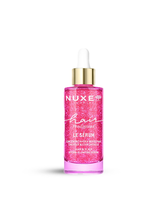
Choosing the Right Glass Bottle for a Serum
Once the formula has been defined, the glass bottle determines much of the product’s physical character.
Its construction influences weight, balance, proportions, transparency and the way the pack feels when consumers repeatedly pick it up and use it. This is why choosing between moulded glass bottle and tubular glass bottles is not simply a manufacturing decision; it also influences how the serum is positioned.
A bottle with a substantial glass base can make the product feel more ritualistic and permanent, while a lighter, highly precise structure can reinforce a more scientific or ingredient-focused identity. Both approaches can feel premium, but they communicate very different ideas about the serum inside.
Moulded Glass Bottles for Weight and Presence
Moulded glass is particularly effective when physical presence is part of the product experience.
Its thicker base and more substantial structure can give a serum greater visual and tactile weight, which is especially valuable for prestige skincare, intensive treatments and premium oil-serum formulas. The consumer feels that presence immediately when picking up the bottle, long before the formula is dispensed.
This physicality can become part of the skincare ritual. A bottle that feels balanced, stable and substantial on the vanity communicates permanence and care, while the thickness of the glass can create additional optical depth around the formula.
However, the value of moulded glass should not be reduced to the idea that heavier automatically means better. Weight only contributes to the product when it reinforces the intended positioning. A highly technical active serum built around minimalism may feel more coherent in a lighter and more restrained structure.
Moulded glass works best when its presence has a purpose.


Tubular Glass Bottles for Precision and Flexibility
Tubular glass creates a very different type of serum packaging.
Its appeal comes from dimensional precision, controlled geometry and a clean visual language. Rather than creating identity primarily through mass or sculptural form, tubular bottles allow proportion itself to become part of the design.
This works particularly well for boosters, active serums and ingredient-led formulations where clarity and technical precision are central to the product story. A relatively simple cylindrical architecture can feel highly considered when the relationship between height, diameter, neck and closure has been carefully controlled.
Tubular glass is also useful for ranges that need visual consistency across several formats or capacities. Different products can retain the same architecture while varying in size, colour or finish, allowing the brand to build a coherent family without making every serum feel identical.
In this context, premium perception comes from restraint. The bottle does not need to appear complex because its precision becomes part of the identity.
Bottle Capacity Should Reflect the Treatment Rhythm

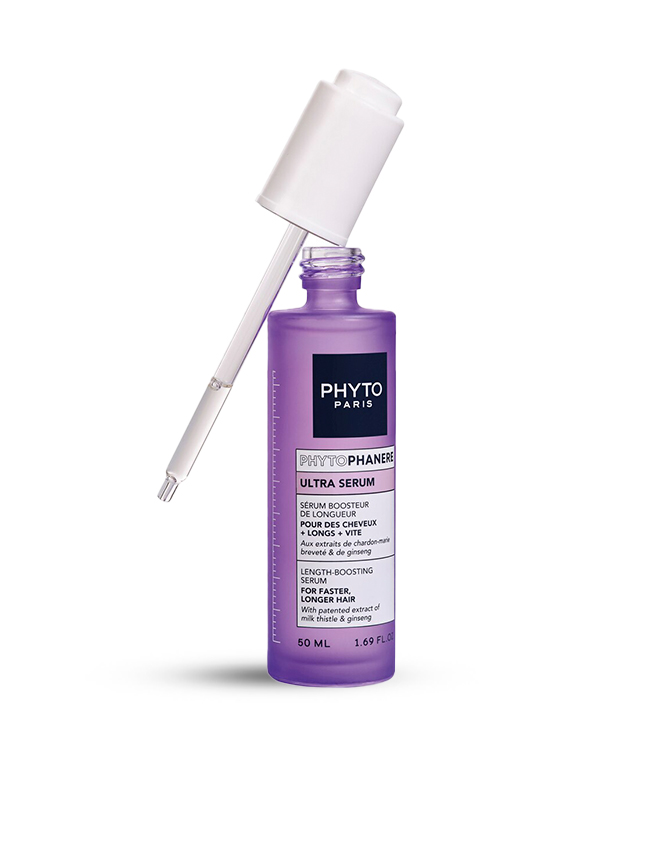
Capacity has a surprisingly strong influence on the way consumers interpret a serum.
A very compact bottle immediately suggests concentration, targeted treatment or limited-duration use, whereas a larger format implies a product intended to become part of a longer and more regular routine. The volume therefore communicates something about the treatment before the instructions are even read.
For this reason, capacity should be aligned with actual dosage and expected duration.
A concentrated booster applied in only a few drops may naturally belong in a smaller bottle, while a hydrating serum designed for generous morning and evening use may require a larger format. Oil-serums may also be consumed more slowly than water-based serums because a relatively small quantity can cover the entire face.
The correct capacity is therefore not simply the size most common in the market. It is the volume that makes sense for the way the serum is intended to be used.
When dosage, frequency and bottle capacity support one another, the packaging becomes intuitive. The consumer understands the product more easily because the physical scale of the pack already reflects the treatment rhythm.
Standard Droppers for Flexible Serum Dosing
For fluid serums, the standard dropper remains one of the most intuitive dispensing systems because it gives consumers direct control over the amount applied.
That flexibility is useful because skincare routines are rarely completely fixed. A consumer may apply only a few drops when layering several products, use more when extending the serum to the neck and décolletage, or adjust the quantity according to skin condition and season.
A traditional dropper accommodates these variations naturally.
Its performance, however, depends on how well the complete dispensing system has been matched to the serum. Formula viscosity, bulb response, airflow and internal dropper configuration all affect how smoothly the product is drawn and released.
A water-light serum may move through the system very quickly, while an oil-rich serum may require more controlled flow. If the interaction is poorly calibrated, the consumer can experience irregular drops, inconsistent filling or difficulty drawing enough product.
When the system has been properly developed, none of this should attract attention. The user simply draws the serum, releases the desired amount and continues the routine.
That effortless predictability is what makes a dropper feel refined.
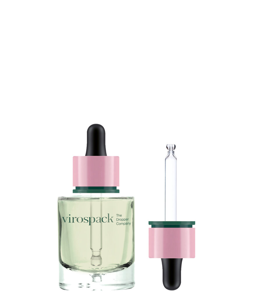
Droppers Catalogue
Discover our full range of droppers catalogue
Push Button Droppers When Repeatability Matters More
A push button dropper changes the relationship between the consumer and the serum by giving the dispensing gesture more structure.
Instead of relying entirely on manual bulb pressure, the user interacts with a defined actuator. This can make the application feel more repeatable, technical and controlled, which is particularly relevant for active serums and high-performance treatments.
The difference between a standard and push button dropper is therefore not merely cosmetic.
A traditional dropper prioritises flexibility. The user decides how much product to draw and how many drops to release.
A push button dropper creates a more engineered interaction in which the dispensing mechanism itself becomes part of the treatment experience.
This can support serums positioned around precision, innovation or advanced performance, especially when the brand wants the packaging to reinforce the idea that application has been carefully considered.
Neither solution is inherently superior. The most appropriate choice depends on the type of control the product is supposed to offer.
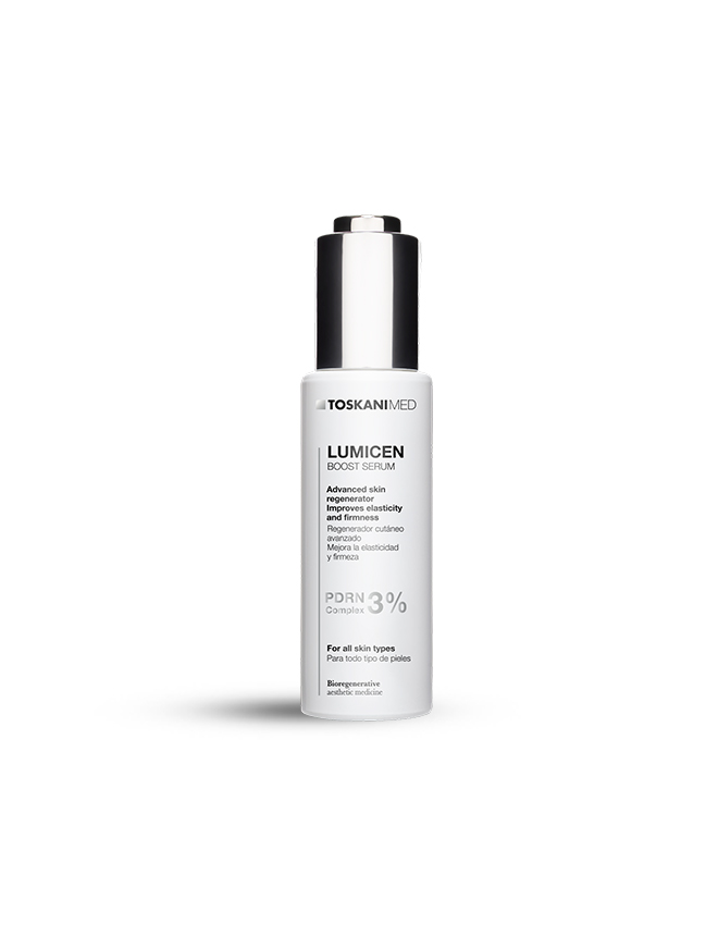
Magnetic Droppers When Closure Becomes Part of the Serum Ritual
For prestige serums, the experience of opening and closing the bottle can become part of the perceived value of the product.
A magnetic dropper introduces a more refined closure gesture by helping the upper component align and return to position in a controlled way. The consumer may not consciously analyse that interaction, but it contributes to the feeling that the packaging has been carefully engineered.
This matters because serum packaging is handled repeatedly over a relatively long period. Small interactions are experienced dozens of times, and their cumulative effect can influence how premium the product feels.
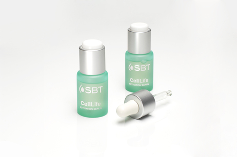
A magnetic system therefore makes the most sense when the pack has been designed around tactile refinement and ritual. It should not be added simply because magnetic closure sounds luxurious.
Its value comes from the way it completes the experience.
The serum ritual begins when the bottle is picked up and only finishes when the closure returns securely to position.
High-Viscosity Serums May Need a Different Solution
The modern serum category includes textures that are much richer than the traditional lightweight liquids associated with droppers.
Some gel-serums, concentrated treatments and hybrid textures are dense enough that conventional dropper dispensing can become inconvenient. The formula may move slowly through the system, fill inconsistently or require more effort than the consumer expects.
At that point, the packaging begins to work against the product.
Forcing a high-viscosity serum into a dropper simply because droppers are visually associated with the category can create a frustrating experience. Instead of reinforcing precision, the pack makes the formula difficult to access.
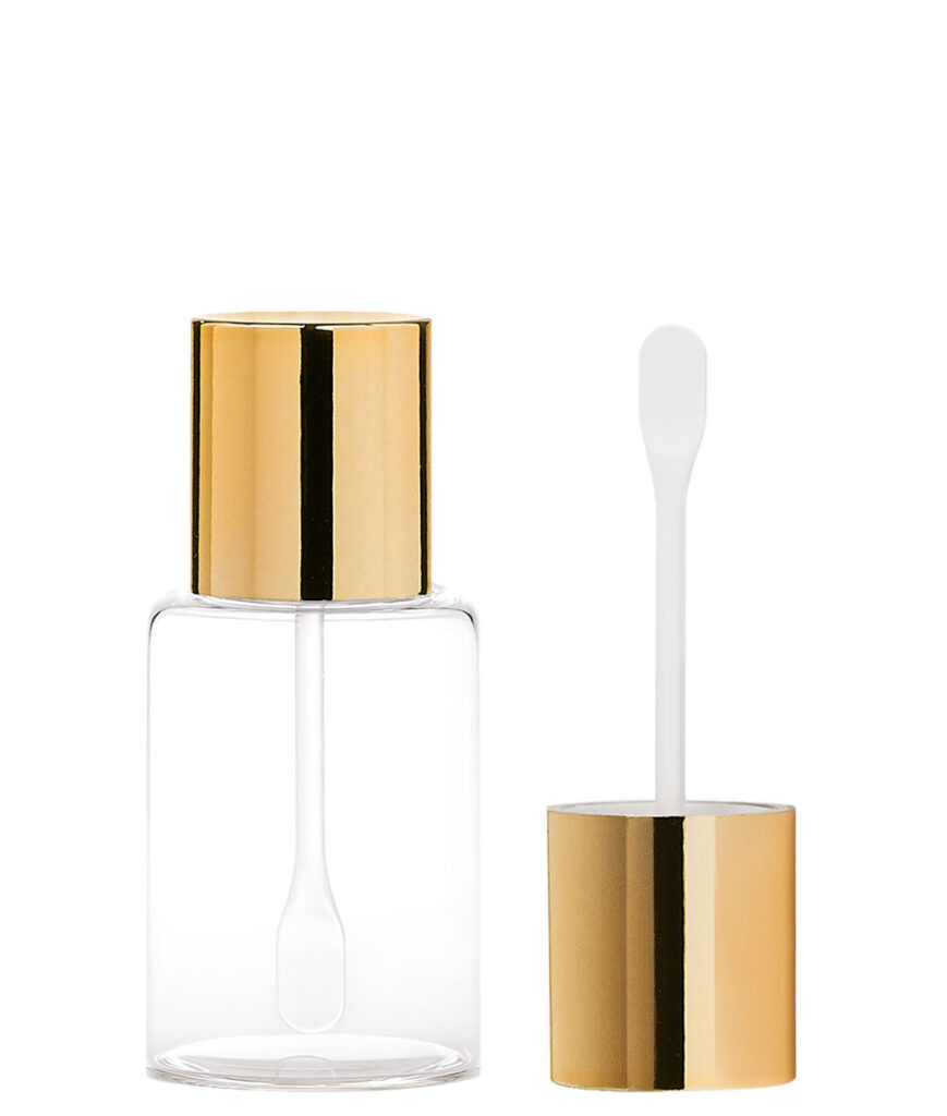
This is where solutions such as caps and spatula holders become relevant.
A richer serum or gel can be accessed directly with a dedicated applicator, allowing the consumer to take the appropriate amount without forcing the formula through a system designed for a much more fluid product.
The principle is straightforward: the dispensing method should follow the behaviour of the formula rather than the naming convention on the label.
Two-Component Serums Need Packaging That Protects the Formula Before Use
Some serums create a packaging challenge that begins before dispensing.
Certain treatments are formulated around ingredients that benefit from remaining separate until the moment of activation. Powder-liquid or liquid-liquid combinations can therefore require a packaging system capable of maintaining that separation and guiding the consumer through preparation.
In this situation, packaging becomes part of the formula architecture.
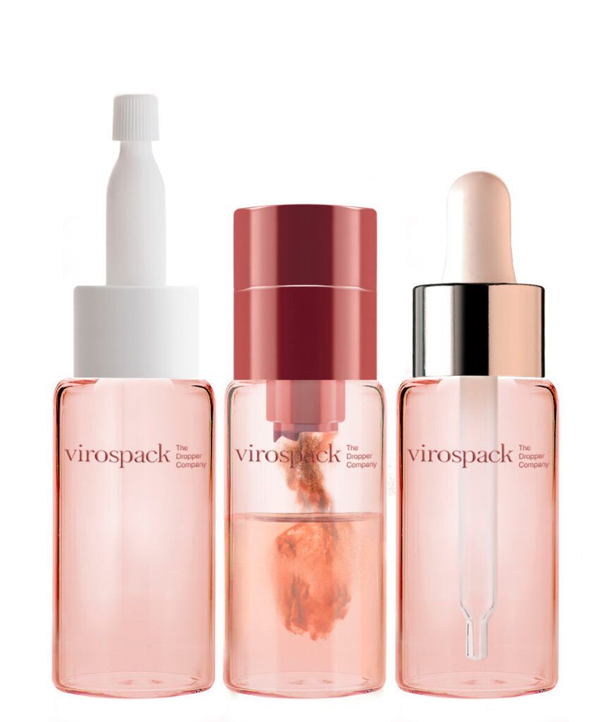
Virospack’s Duo Mix concept responds to precisely this type of requirement by allowing two components to remain separated until the product is prepared for use.
This changes the role of serum packaging completely.
The container no longer passively stores a finished formula. It participates in creating the treatment.
For the consumer, the activation gesture can also reinforce the technical character of the product. It makes the formula feel fresher, more deliberate and more closely connected to performance.
This approach can be particularly relevant for treatment concepts based around vitamin C or other active systems where preparation and freshness are central to the product story.
The Finish Should Respond to Formula Visibility and Sensitivity
Once the glass construction and dispensing system have been defined, the finish determines how the formula participates in the visual experience.
This decision goes beyond aesthetics because serum visibility can itself become part of the product proposition.
A clear bottle allows the consumer to observe colour, movement and remaining product level. A frosted or translucent surface creates more distance, softening the way the serum appears through the glass. An opaque or dark treatment shifts attention away from the liquid and towards the packaging itself.
The correct finish therefore depends on what the brand wants the consumer to see and what the formula requires technically.


Clear Glass When Formula Visibility Matters
Clear glass makes the serum itself part of the packaging design.
This can be particularly effective when the formula has an attractive natural colour, a luminous oil-like appearance or a highly transparent texture that reinforces purity and simplicity.
The consumer can see the product immediately, which can strengthen trust and visual interest.
However, transparency should be treated as an intentional choice rather than as the default option.
By revealing the serum completely, the brand also makes every variation in colour, level and appearance more visible.
Clear glass works best when that exposure contributes positively to the product experience.

Amber or Darker Glass for More Protective Positioning
Darker glass changes the relationship between the consumer and the formula.
The product becomes less visually exposed, while the bottle communicates a stronger sense of treatment, protection and ingredient care.
Amber glass can work particularly well for botanical, oil-based or active serum concepts, while deep blue, black or other dark finishes can move the product towards different visual territories.
However, the colour itself should never be confused with verified protection.
The technical requirement must be established first. Once the formula’s light sensitivity is understood, the bottle colour and finish can then reinforce that strategy visually.
Packaging performs best when technical necessity and visual language point in the same direction.
Frosted and Matte Finishes for Softer Visual Control
Frosted and matte finishes offer a middle ground between complete visibility and opacity.
They allow the formula to remain perceptible while diffusing reflections and softening the overall appearance of the bottle.
This can be particularly effective for premium serums where the brand wants the packaging to feel refined, sensorial and restrained rather than highly glossy.
The formula remains present, but it is viewed through a controlled visual filter.
That subtle distance can make the product feel more considered without requiring complex decoration.

Opaque and Custom-Coloured Finishes for Stronger Brand Identity
When formula visibility is not central to the concept, the glass bottle can become a much stronger branding surface.
Opaque colours allow brands to establish recognisable visual codes across a serum range, while matte and glossy variations can make the same colour feel completely different.
This approach is especially effective when the bottle architecture itself is relatively simple.
Colour can provide the differentiation that would otherwise need to come from a more complex structure.
A straightforward glass bottle can become highly recognisable when its colour, finish and graphic treatment are controlled consistently across the range.


Gradient and Pearlescent Finishes for More Expressive Serum Packaging
Gradient and pearlescent effects allow brands to introduce greater visual movement without changing the physical shape of the bottle.
A gradient can move from dark to transparent, from one colour into another or from greater intensity at the base towards a lighter upper section. Because it uses the height of the bottle as part of the design, it can visually alter the proportions of even a simple glass structure.
Pearlescent finishes create a different effect by changing subtly with light and viewing angle.
Both can make serum packaging more expressive, but they require restraint.
If the bottle shape, closure, colour transition and decoration all compete for attention, the overall identity becomes weaker rather than stronger.
The finish should reinforce the serum’s story rather than create a second story of its own.
Decoration Should Complete the Serum Bottle, Not Compete with It
Decoration should enter the development process after the bottle, dropper and finish already have a clear role.
At this point, the goal is not to create identity from nothing. It is to reinforce the identity that already exists.
Screen printing can integrate typography directly into the glass and works especially well when the bottle surface itself deserves to remain visible.
Hot stamping can introduce controlled metallic accents around a logo or small detail, adding contrast without turning the entire bottle into a decorative object.
Metallization can create a much stronger transformation, shifting the pack towards a reflective and more architectural visual language.
Painting can define the entire colour strategy, from translucent treatments to completely opaque surfaces.
The important question is how much visual weight each technique should carry.
A strong moulded bottle may need only minimal typography.
A very clean tubular structure can leave more room for colour and graphic elements.
A visually dominant closure may require quieter treatment of the glass.
The best serum packaging has hierarchy.
Nothing feels decorative simply because it could be added.

Metal Shell Bottles When the Serum Needs More Physical Presence

Some serum concepts need a stronger external structure than glass alone provides.
A metal shell bottle can introduce a more architectural and tactile dimension, changing both the physical presence of the pack and the amount of the inner bottle that remains visible.
This approach can make sense for prestige serums where the container is expected to feel substantial and object-like.
The metal exterior can reinforce protection, add weight and create a more permanent feeling in the hand. If the design includes a window, the inner bottle or formula can still remain partially visible while the metal structure dominates the overall identity.
The decision should nevertheless support the product concept.
If transparency and formula visibility are central to the serum’s appeal, covering the bottle extensively may work against the product. If the objective is stronger tactile presence, visual protection or a more architectural luxury language, the metal shell can be extremely coherent.
As with every other packaging choice, the additional material should solve a real positioning need.
Bottle, Dropper and Finish Have to Be Designed Together
The most successful serum bottle packaging feels coherent because the consumer never experiences its components as separate decisions.
- The bottle influences the dropper.
- The dropper changes the visual weight of the upper section.
- The finish alters how the bottle interacts with light.
Decoration changes where the eye goes.
A substantial moulded bottle paired with an undersized dropper can feel visually unbalanced. A slim tubular bottle can lose its precision if the closure overwhelms its proportions. A transparent bottle may reveal the serum beautifully while contradicting its protection requirements, while an opaque finish can hide a formula whose colour might otherwise have been one of its strongest visual assets.
The choice between a standard and push button dropper changes the personality of the product as well, even when the glass bottle remains identical.
This is why the development hierarchy matters.
The formula should determine the bottle, the bottle and formula should determine the dropper, and together they should guide the choice of finish and decoration.
When the process follows that sequence, the final pack feels coherent because every element has a reason to be there.

Compatibility Testing Is Part of Choosing the Right Serum Packaging
The visual design of a serum pack may be complete long before the technical development is finished.
The bottle and dropper still have to work with the real formula over time.
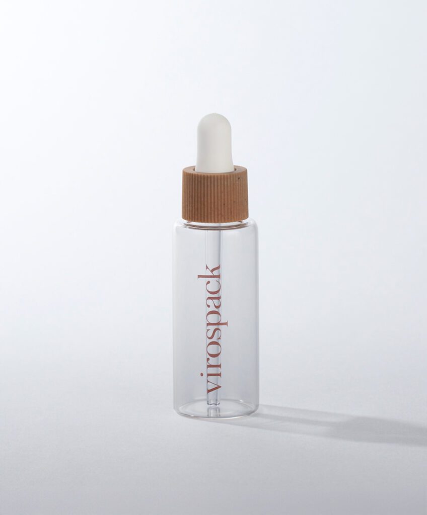
Serums can contain oils, active ingredients, fragrances, solvents and other components that interact differently with the materials in the complete packaging system. Although glass itself provides a relatively stable environment for many formulas, the dropper contains additional components that also need to be evaluated.
The behaviour of the serum may change as well.
Viscosity, flow and dispensing performance can evolve during storage, meaning a dropper that works perfectly during initial trials may perform differently after prolonged contact with the formula.
This is why compatibility and functionality testing should be considered part of packaging development rather than a final formality.
The right serum bottle is not simply the bottle that looks convincing in a prototype.
It is the complete system that continues to dispense, close, protect and present the formula correctly throughout the life of the product.
How to Choose Serum Bottle Packaging Step by Step
Although serum packaging involves many variables, the decision becomes much clearer when every stage follows the behaviour of the formula.

1. Understand the formula
Begin by evaluating viscosity, ingredient profile, sensitivity, intended dosage and application method. These characteristics will influence almost every later packaging decision.
2. Define the dispensing experience
Determine whether consumers need flexible manual dosage through a standard dropper, a more repeatable gesture through a push button dropper, a refined closure experience with a magnetic system, or another form of access for a richer texture.
3. Select the glass architecture
Choose moulded glass when physical presence, weight and ritual are important to the product, or tubular glass when clean geometry, precision and dimensional flexibility better express the serum.
4. Match capacity to actual use
The bottle volume should reflect dosage, frequency and expected treatment duration rather than being selected simply because it is a common market size.
5. Decide how visible the serum should be
Evaluate whether transparency contributes positively to the product or whether amber, frosted, translucent, opaque or darker finishes better support the formula and brand positioning.
6. Use decoration to reinforce what already works
Screen printing, hot stamping, metallization and painting should strengthen the existing hierarchy rather than compete with the bottle and dropper.
7. Test the complete packaging system
The final choice should be validated with the real formula to confirm compatibility, dispensing performance, closure behaviour and stability of the decorative treatment.
When all these decisions support one another, the consumer does not experience a bottle, a dropper and a finish.
They experience one serum package designed around one formula.
Frequently Asked Questions About Serum Bottle Packaging
What is the best packaging for a serum?
There is no single packaging format that is ideal for every serum. Fluid formulas often work naturally with glass bottles and droppers, while richer textures may require another dispensing method. The best choice depends on viscosity, dosage, ingredient sensitivity, treatment duration and how the serum is intended to be applied.
Is moulded or tubular glass better for serum bottles?
Both can be appropriate for premium serum packaging. Moulded glass is particularly effective when weight, physical presence and ritual are important, while tubular glass works well when the product benefits from clean geometry, visual precision and greater dimensional flexibility.
Should a serum use a standard or push button dropper?
A standard dropper is useful when consumers benefit from controlling the amount themselves, whereas a push button dropper provides a more defined and repeatable dispensing gesture. The choice should reflect the serum’s dosage requirements and the experience the brand wants to create.
What bottle finish is best for serum packaging?
The finish should respond to both formula requirements and visual strategy. Clear glass makes the serum itself more visible, frosted and translucent finishes create softer visual control, while amber, darker or opaque treatments can reduce exposure and shift attention towards the bottle.
Can thick serums use droppers?
Some can, but viscosity should always be tested with the complete dropper system. If the serum moves too slowly, fills inconsistently or becomes difficult to dispense, a different access method may provide a better experience. Caps with spatula holders can be particularly suitable for richer serums and gel textures.
What packaging works for two-component serums?
Two-component serums require packaging capable of keeping their ingredients separated until activation. Systems such as Duo Mix can integrate this separation into the pack itself, allowing powder-liquid or liquid-liquid treatments to be prepared immediately before use.