

Colorful Packaging: Vibrant Glass Bottle Designs That Stand Out
In beauty packaging, color is not an accessory — it is a strategic tool that defines identity, communicates product benefits, and creates emotional connection. When applied to glass, color becomes a technical discipline that blends chemistry, optics, engineering, and design. For brands operating in premium skincare, haircare, and cosmetics, colorful packaging is not simply a matter of choosing a Pantone shade; it requires industrial precision, stability, repeatability, and an expert understanding of how color behaves on glass surfaces.
At Virospack, color is treated as an art form. With more than 65 years of expertise in glass packaging manufacturing, the company combines advanced decoration techniques with sustainable processes to deliver glass bottles and droppers that capture attention and elevate every product’s aesthetic impact.

Table of Contents
Colorful Packaging Manufactured by Virospack (Showroom Selection)
Color-based storytelling backed by engineering.
The strongest proof of expertise in colorful packaging comes from real production cases. These examples, manufactured at Virospack’s facilities, illustrate the technical depth, industrial precision, and chromatic creativity required to deliver world-class packaging for luxury beauty brands.
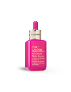
Estée Lauder – Pink Advanced Night Repair (Limited Edition)
A reinvention of an icon, this edition required uniform high-saturation lacquering over premium extra-flint glass.
Key technical aspects:
- Multilayer lacquering system to achieve full opacity without compromising gloss.
- Precision control of film thickness, ensuring the pink tone remained consistent across thousands of units.
- UV-curing parameters adjusted to maintain chromatic stability over time.
- Adhesion and resistance testing, including abrasion and chemical compatibility.
Result: a vibrant, jewel-like finish that transforms ANR into a collectible object while preserving the optical clarity associated with Estée Lauder.
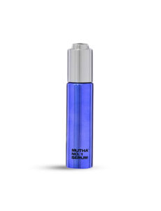
MUTHA – No.1 Serum
A reference in luxury metallic aesthetics, this project showcases Virospack’s mastery of vacuum metallization on glass.
Technical highlights:
- High-reflective aluminum deposition under controlled pressure and temperature.
- Top-coat protection to maintain mirror effect and prevent micro-scratches.
- Perfect alignment between metallized bottle and decorated dropper, ensuring chromatic harmony across materials.
The result is a striking, sculpture-like bottle with a flawless metallic surface — a finish only achievable with advanced industrial expertise.
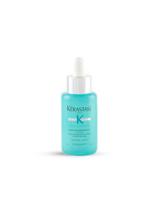
Kérastase – Résistance Sérum Extentioniste
This serum relies on a semi-translucent mint tone that visually communicates growth, vitality, and hair-fibre strength.
Technical requirements:
- Lacquering with controlled transparency, allowing the formula to be partially visible.
- Color calibration to maintain saturation regardless of viewing angle.
- Spectrophotometric verification to ensure consistency across production batches.
This is a clear example of functional color coding used to support product positioning within a professional haircare brand.
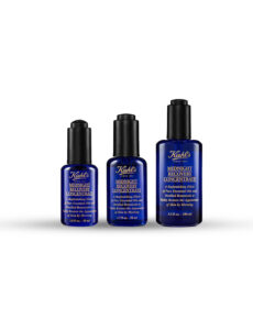
Kiehl’s – Midnight Recovery Concentrate
An emblematic case of deep chromatic storytelling. The challenge: achieving an intense midnight-blue tone while preserving translucency.
Technical insights:
- Transparent lacquering balanced through controlled pigment concentration.
- Optical density monitoring to keep the exact level of light transmission.
- Stable curing that ensures the blue remains vivid even after UV exposure.
This iconic finish demonstrates how color can embody a formula’s narrative — in this case, night-time repair and botanical efficacy.
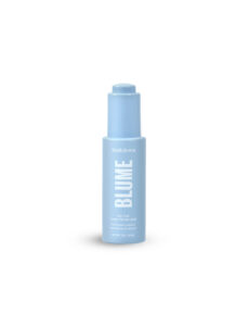
Blume – Meltdown Oil
Designed for a Gen Z audience, Blume’s pastel universe required soft, bright tones with perfect surface uniformity.
Technical execution:
- High-performance pastel lacquers resistant to fading.
- Color matching across bottle, bulb, and cap, ensuring a unified visual identity.
- Low-thickness lacquering to maintain a lightweight aesthetic aligned with the brand’s simplicity.
A clear example of how pastel tones can feel premium when supported by high-quality glass and precise decoration.
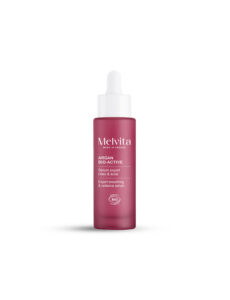
Melvita – Sérum Rides & Éclat Bio
Melvita’s aesthetic is grounded in natural, matte tones that communicate organic purity.
Technical notes:
- Matte lacquering with microtextured finish, adding a sensorial, soft-touch effect.
- Fine pigment dispersion to prevent haze on matte surfaces.
- Eco-friendly lacquers aligned with the brand’s sustainability values.
This case demonstrates how natural tones can achieve a premium finish when supported by precise formulation.
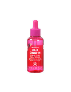
Lee Stafford – Hair Growth Stimulating Scalp Serum+
Known for its punchy pink identity, Lee Stafford relies on bold saturated tones for high shelf visibility.
Technical requirements:
- High-opacity lacquers with strong chromatic impact.
- Strict ΔE tolerances to ensure color consistency across haircare references.
- High-adhesion coatings resistant to frequent handling in haircare routines.
The result is packaging where color becomes the brand’s signature visual code.
Why Colorful Packaging Matters in the Beauty Industry
Before exploring decoration techniques or bottle formats, it’s important to understand why color has become a strategic pillar in modern beauty packaging. In an industry where products compete for attention both on shelves and on screens, color is the visual language that defines emotion, identity, and memorability. This section explores how color shapes perception, builds loyalty, and helps beauty brands stand out in a saturated market.
A Visual Language That Defines Brands
Color is the first thing consumers notice. Long before they read a label or recognize a logo, they react emotionally to hue, brightness, and tone. In cosmetics, this reaction can determine purchase intent in just seconds. Whether it’s the minimal white of a clean skincare line or the vibrant pink of a playful makeup range, color communicates who the brand is and what it stands for.
Major brands have leveraged this to perfection — Glossier uses pastels for approachability and softness, Fenty Beauty plays with deep contrasts to celebrate inclusivity, and Drunk Elephant builds recognition through bold neon accents. In each case, the color palette has become as iconic as the product itself.
The Psychology Behind Color Choices
Every shade evokes a specific emotional response, influencing how consumers feel about both the product and the brand:
- White and neutral tones evoke cleanliness, simplicity, and transparency — key in “clean beauty” positioning.
- Pastel hues like blush, lilac, and mint convey calm, self-care, and elegance.
- Metallics (gold, rose gold, silver) suggest luxury, success, and performance.
- Bright tones — coral, turquoise, fuchsia — signal creativity, youth, and confidence.
Virospack helps brands express these emotions through precise color matching, lacquering, and silk-screen printing, turning psychological insight into tangible glass design.
Driving Shelf Impact and Digital Engagement
Color doesn’t just catch the eye; it drives action. In physical retail, vibrant bottles stand out on crowded displays, while online, colorful packaging boosts engagement and shareability. Instagrammable products — those that look beautiful on a feed — often owe their virality to distinctive color design.
Virospack’s collaboration with leading brands showcased in its Showroom proves that color consistency enhances both offline visibility and digital storytelling, creating packaging that consumers love to display as much as they love to use.
Balancing Creativity and Consistency
Finally, successful brands know that color is not just about creativity but coherence. Maintaining a recognizable chromatic code across skincare, makeup, and haircare lines ensures brand harmony. For example, a consistent gradient from soft peach to nude can link an entire product family while allowing each reference its own personality.
Thanks to Virospack’s fully integrated decoration facilities in Barcelona, every tone — from the lightest pastel to the most saturated metallic — is produced with precision, repeatability, and environmental responsibility.
Droppers Catalogue
Discover our full range of droppers catalogue
The Art and Science Behind Color Decoration
Techniques That Bring Color to Life
Virospack’s decoration facilities in Barcelona offer complete in-house decoration processes, ensuring precision and creativity in every project. The following techniques are key to achieving expressive and long-lasting colorful finishes:
- Lacquering: Provides smooth, uniform color coverage in matte, glossy, or satin finishes. Ideal for pastel tones and full-surface effects.
- Gradient Effects (Ombre): Achieved through controlled spray lacquering, creating elegant transitions — for instance, pink to clear or amber to transparent.
- Metallization: Adds reflective, mirror-like brilliance in gold, silver, rose gold, or iridescent hues, perfect for luxury positioning.
- Hot Stamping: Applies metallic or pearlescent details to logos or accents.
- Silk-Screen Printing: Enables precise branding in color or white inks.
- Soft-Touch Coating: Adds tactile dimension with a velvety feel.
Each technique can be combined or layered for unique results that reinforce a brand’s identity and storytelling.
Sustainable Color Innovation
Beauty brands today demand not just color impact but eco-responsibility. Virospack’s coloring processes use water-based inks and solvent-free lacquers, minimizing VOC emissions while maintaining impeccable finish quality. The brand’s ISO 14001 and EMAS certifications guarantee that its decoration lines operate under the highest sustainability standards.
Catalogue Highlights: Color-Ready Glass Bottles
Virospack’s official catalogue offers a complete range of color-compatible bottles and droppers, ready for custom decoration:
- Moulded Glass Bottles (15 ml–60 ml): Premium bottles ideal for luxury skincare and makeup. Available in clear, extra-flint, amber, or colored glass — perfect for lacquering and metallization.
- Tubular Glass Bottles (10 ml–35 ml): Sleek, lightweight bottles compatible with custom finishes and wiper systems, ideal for colorful serums or highlighters.
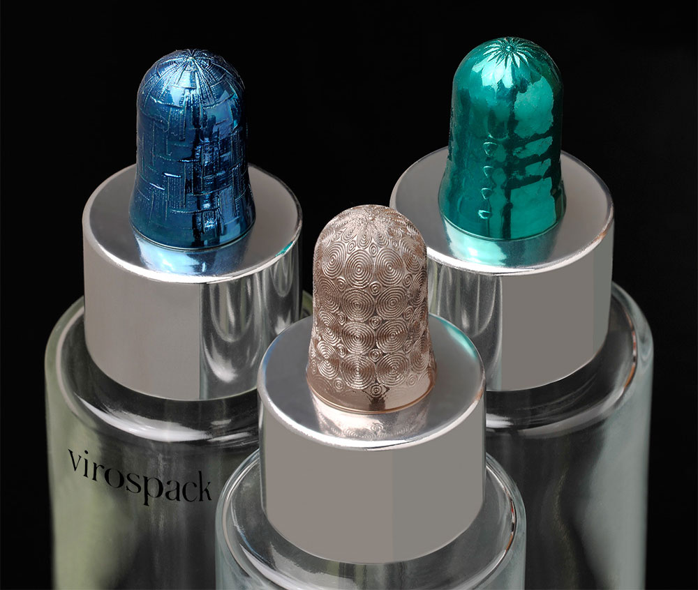
- Droppers and Push-Button Droppers: Customizable bulbs, pipettes, and caps available in bold tones or metallic finishes, enhancing the overall visual harmony of the packaging.
- Airless Bottles: Designed for creams and emulsions, these can also be personalized with color gradients and silk-screen branding.
Each component is designed for both performance and beauty, allowing brands to translate their chromatic identity into tangible packaging.
The Psychology of Color in Cosmetic Branding
Understanding how consumers perceive color can guide your packaging decisions:
- White: Purity, minimalism, and safety — common in clean beauty brands.
- Pink & Pastel Tones: Softness, femininity, and approachability — perfect for skincare and youthful makeup.
- Gold & Metallics: Prestige, warmth, and opulence — used in anti-aging or luxury lines.
- Blue & Green: Calmness, freshness, and nature — suited for hydrating or organic collections.
- Black & Deep Shades: Sophistication, modernity, and strength — often used for unisex or professional treatments.
At Virospack, expert teams help brands select color strategies aligned with emotional impact and market trends.
Sustainability Meets Aesthetics
Color and sustainability no longer conflict — they coexist. Virospack integrates eco-conscious materials like PCR glass and mono-material droppers to ensure that even the most vibrant packaging remains environmentally responsible.
- EcoDropper: A 100% recyclable mono-material dropper that can also be finished in custom colors.
- PCR Glass and Plastics: Offering tinted PCR bottles with the same clarity and performance as virgin materials.
- Solvent-Free Decoration: Achieves luminous results without harmful chemicals.
- Closed-Loop Manufacturing: In-house control from glass moulding to decoration reduces waste and logistics emissions.
By aligning visual creativity with sustainability, Virospack enables brands to deliver beauty that’s both conscious and captivating.
Why Virospack Is the Benchmark for Colorful Packaging

Choosing a supplier for colorful packaging means choosing a creative and technical partner capable of translating brand identity into vibrant glass. Virospack stands as a benchmark thanks to:
- 65+ years of experience in glass packaging manufacturing.
- Full in-house control of moulding, injection, and decoration.
- Award-winning sustainable innovations such as the EcoDropper and DuoMix systems.
- Collaborations with global brands showcased in the Virospack Showroom.
- Unlimited creative freedom — from subtle shades to bold chromatic statements.
Color is more than surface beauty. It’s a message, a signature, and a bridge between product and consumer. At Virospack, every hue is crafted to tell that story.
Frequently Asked Questions About Beauty Packaging
What decoration techniques work best for colorful packaging?
Spray lacquering, gradient effects, and metallization are among the most effective and durable methods for glass bottles.
Can colorful bottles be sustainable?
Yes. Virospack uses water-based, solvent-free lacquers and PCR materials, ensuring eco-friendly yet vibrant designs.
Does color affect consumer perception?
Absolutely. Colors evoke emotion and help define brand identity, making them key to differentiation in crowded markets.
Can I order custom colors for small runs?
Yes. Virospack offers flexible minimum orders, supporting indie and emerging brands alongside large-scale production.