

Innovative Cosmetic Packaging: How Dispensing Systems, Decoration and Materials Are Evolving
Innovation in cosmetic packaging is no longer defined by unusual shapes or decorative complexity alone.
The most interesting developments are happening in the way packaging behaves.
How precisely does it dispense the formula? How intuitive is the gesture? How does the closure feel after dozens of uses? Can the same packaging communicate technical performance and premium value without becoming visually excessive? And can the bottle, dispensing system and decoration be developed as one coherent object rather than as separate components?
These questions are reshaping innovative cosmetic packaging.
In skincare, hair care and liquid makeup, the dispenser has become especially important because formulas are increasingly concentrated, lightweight and designed around controlled application. At the same time, glass construction and decoration are evolving from passive visual choices into tools that help brands differentiate products through weight, transparency, proportion and tactile experience.
Push button droppers and magnetic droppers illustrate this shift particularly well.
They do not simply change how a bottle looks.
They change how the consumer interacts with it.

Table of Contents
Innovation Is Moving from Appearance to Interaction
For many years, cosmetic packaging innovation was often understood visually.
A different bottle shape, an unusual colour or a highly decorative finish could make a product feel new.
Those elements still matter, but premium beauty has become much more demanding.
Consumers handle skincare packaging repeatedly. A serum bottle may be opened and closed every morning and evening for weeks. This means the experience of the mechanism gradually becomes as important as the first visual impression.
If the dispenser feels inconsistent, the product loses precision.
If the closure feels weak, the bottle loses perceived value.
If the application requires too much effort, even sophisticated packaging can begin to feel poorly resolved.
This is why the most relevant innovation increasingly happens through interaction.
The dispenser controls the product.
The closure controls the final gesture.
The glass influences weight and balance.
Decoration reinforces the visual identity.
When these elements are developed together, packaging stops being a decorative shell and becomes part of the product experience itself.

Why Dispensing Systems Are Becoming Central to Cosmetic Innovation
Modern cosmetic formulas are increasingly designed around small, deliberate quantities.
Serums, eye treatments, oils, boosters, lotions and fluid makeup products may only require a limited amount during each application, making the relationship between formula and dispensing system particularly important.
A conventional dropper already supports controlled application, but innovative dispensing systems go further by shaping the gesture itself.
Instead of simply asking how the formula leaves the bottle, brands can now consider how repeatable the movement should feel, how much control the consumer should have and what the mechanism communicates about the product.
This is where push button droppers become particularly relevant.
They turn dosage into a more structured interaction.
Magnetic droppers address a different moment: not primarily the release of the formula, but the way the package closes and completes the ritual.
These innovations operate at different points in the user journey, but they share the same principle.
The mechanism becomes part of the brand experience.

Push Button Droppers Make Precision Visible
Push button droppers represent a clear evolution of the traditional dropper experience.
With a standard bulb system, the consumer controls the dispensing action manually. A push button dropper introduces a defined actuator, making the interaction feel more deliberate and engineered.
That difference can be subtle physically but significant perceptually.
When a consumer presses a button to access a high-performance serum, the mechanism reinforces the idea that the formula is being handled with precision. The packaging itself begins to support the positioning of the treatment.
Virospack’s push button dropper range is designed for fluid products including serums, eye contours, lotions, oils and liquid makeup, and currently includes different actuator configurations such as convex, concave, syringe-style and flat formats. The range also offers several dosage configurations, allowing the dispensing architecture to be adapted to different product concepts rather than relying on a single standard solution.
This is an important point in innovative cosmetic packaging.
Innovation does not mean replacing every familiar gesture with something complicated.
It means creating more control where control adds value.
Droppers Catalogue
Discover our full range of droppers catalogue
Push Button Systems Change the Personality of the Product
A dispensing mechanism does more than release formula.
It also influences how the product is interpreted.
A traditional dropper tends to feel familiar, flexible and sensorial. The consumer controls the bulb and decides how much formula to release.
A push button system feels more technical.
The actuator creates a clearer start and end to the dispensing gesture, which can reinforce product concepts built around efficacy, advanced treatment or controlled application.
L’Atelier Shelter Beard Oil shows this clearly. The bottle itself is relatively restrained, with a tall cylindrical body and a predominantly matte black finish, but the upper component changes the character of the entire pack. Instead of a conventional bulb, the elongated push button structure gives the bottle a more engineered and almost tool-like appearance. The small circular actuator at the top makes the dispensing gesture immediately visible before the product is even used.
That matters because the formula is an oil, a category that could easily be presented through a much more traditional or apothecary-inspired dropper. Here, the push button moves the product in another direction. The packaging feels more contemporary, controlled and design-led, while the dark monochromatic treatment reinforces that technical character.
This is a good example of how the same basic product category can communicate very different values depending on the dispenser selected.
A traditional dropper might emphasise craft, ritual or familiarity.
A push button system can emphasise control, precision and modernity.
The dispensing system therefore becomes a form of visual language.
Before the product has been applied, the mechanism has already suggested how the formula should be experienced.

Different Push Button Configurations Allow Different Experiences
There is also no reason for every push button dropper to feel identical.
The actuator itself can influence both ergonomics and visual identity.
A convex button creates a different tactile relationship from a flat or concave surface. A syringe-inspired design can make the pack feel more technical, while a quieter upper component may integrate more naturally into a restrained luxury bottle.
Virospack’s current range reflects this variety through multiple push-button forms, neck configurations, dosage options and the possibility of metal overshells.
This creates opportunities beyond simple functional differentiation.
The upper component can become part of the bottle architecture.
Its height can reinforce verticality.
Its diameter can continue the bottle silhouette.
A metallic exterior can introduce contrast.
A coloured finish can integrate the dropper into a broader range identity.
This is where dispensing design begins to overlap with industrial design.
The mechanism no longer sits on top of the bottle.
It becomes part of the bottle.

Magnetic Droppers Innovate at the Moment of Closure
Magnetic droppers address a different part of the packaging experience.
The innovation happens when the consumer closes the product.
Traditional closures depend primarily on mechanical engagement. A magnetic system introduces a controlled attraction that guides the upper component into position, turning closure into a more tactile and deliberate gesture.
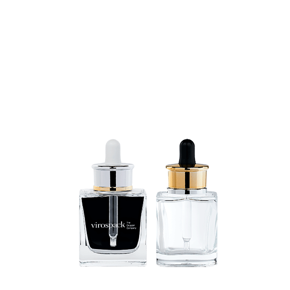
Virospack’s magnetic dropper is built as a two-piece system consisting of the dropper and a clip-on embellisher for FEA15 bottles. The range currently includes two collar designs and 0.65 ml and 0.80 ml configurations, with customization available through finishes such as screen printing, hot stamping, painting and metallization. Virospack describes the system as designed to provide a secure, leak-free magnetic closure.
The important innovation here is not magnetism for its own sake.
It is what magnetism changes in the experience.
The consumer feels the component return to position.
Alignment becomes part of the interaction.
The bottle feels complete when it closes.
For prestige cosmetics, these small tactile signals can be extremely powerful.
Luxury Is Increasingly Expressed Through Movement
Traditional luxury packaging often communicated value through weight, decorative metal or elaborate glass.
Contemporary luxury can also be communicated through movement.
- A closure that aligns precisely.
- A push button that responds consistently.
- A magnetic component that settles into place.
These interactions are experienced repeatedly throughout the life of the product, which means they can influence perceived quality more deeply than a purely decorative detail seen only at first glance.
This does not make decoration less important.
It changes the balance.
A premium pack no longer needs to prove its value only through visual richness. It can communicate sophistication through how naturally and precisely it behaves.
This is particularly relevant in skincare, where ritual is central to the experience.
The product may only be applied for a few seconds, but the opening, dispensing and closing gestures are repeated hundreds of times across the lifetime of the bottle.
Innovation can exist in each of those seconds.

Innovative Dispensing Still Has to Follow the Formula
An advanced dispensing system only makes sense when it works naturally with the product inside.
This is where cosmetic packaging innovation needs discipline.
A push button dropper may reinforce precision beautifully, but that does not mean every liquid cosmetic formula needs one.
A magnetic dropper may elevate a prestige treatment, but it adds little if the rest of the product concept does not depend on ritual or tactile refinement.
The formula still comes first.
Its viscosity, intended dosage, application area and usage frequency should determine whether a particular system adds genuine value.
Innovation becomes credible when the consumer can feel why the mechanism exists.
If the product is highly concentrated, more controlled dispensing makes sense.
If the positioning is built around prestige and ritual, a more refined closure experience can make sense.
If neither applies, complexity risks becoming decorative engineering.
The best innovative packaging solves something.

Glass Is Evolving Alongside Dispensing Technology

Advanced dispensing needs an equally considered bottle beneath it.
This is where glass construction becomes important.
Moulded glass bottles and tubular glass bottles provide different foundations for innovative cosmetic packaging because they create different relationships between weight, geometry and the dispensing system.
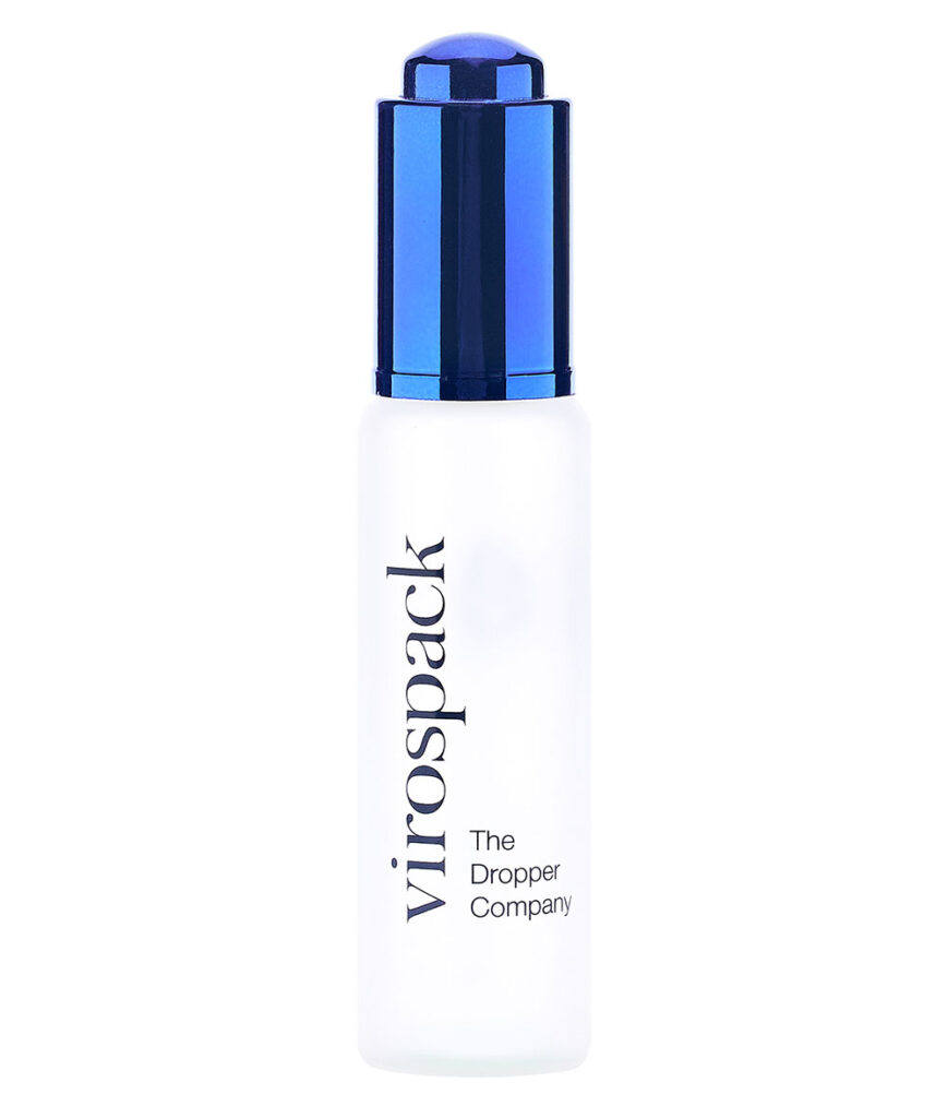
Virospack’s moulded glass range uses thick bases to add weight and physical presence. It includes Wide and Slim architectures in several capacities, and the Wide 30 ml and 50 ml versions incorporate a last-drop system. The bottles are compatible with the company’s dropper range and can be customized through different finishes and decoration techniques.
Tubular glass takes a different approach. Virospack highlights its strength-to-weight ratio, transparency and neutrality, as well as the ability to adapt dimensions without investing in new moulds for each size.
Neither construction is inherently more innovative.
They enable different kinds of innovation.
Moulded Glass Gives Innovative Systems More Physical Presence
A sophisticated dispenser can feel very different depending on the bottle beneath it.
With moulded glass, the greater physical presence of the bottle can reinforce the mechanical sophistication of a push button or magnetic dropper.
A substantial base provides visual stability.
A wider body can balance a more dominant upper component.
The additional weight can make the dispensing gesture feel more grounded in the hand.
This is especially relevant when the product concept is built around prestige.
The consumer experiences the bottle and mechanism simultaneously. If the closure communicates precision but the bottle feels visually or physically weak, the experience can become inconsistent.
Moulded glass allows the container itself to carry enough presence to support a stronger dispensing system.
In this type of packaging, innovation emerges from the relationship between mechanism and material rather than from either element alone.


Tubular Glass Supports a More Technical Type of Innovation
Tubular glass offers a different design territory.
Its precision, transparency and dimensional flexibility make it especially compatible with cosmetic concepts where innovation needs to feel clean, efficient and highly controlled.
Because tubular glass can be adjusted through height, diameter and neck configuration, it allows brands to explore proportion without necessarily relying on highly sculptural glass forms. Virospack also produces tubular glass in transparent or amber neutral hydrolytic glass and highlights its flexibility in adapting bottle dimensions to specific requirements.
This can work particularly well with advanced dispensing systems.
A push button dropper can become the visual focus of a restrained tubular bottle.
A magnetic closure can introduce tactile sophistication without requiring elaborate glass.
The contrast between simple geometry and advanced interaction can itself become the design concept.
Innovation does not always need to look complicated.
Sometimes precision is the innovation.
Decoration Is Moving Beyond a Final Cosmetic Layer
Decoration is no longer something that needs to be added after the bottle and dispensing system have already been defined.
In innovative cosmetic packaging, it increasingly participates in the architecture of the pack from the beginning. Colour can determine how much of the glass remains visible, metallic treatments can shift visual weight towards the upper component, and printing can either reinforce the geometry of the bottle or deliberately disappear behind the formula.
The result can be seen in products that use very different levels of intervention.
Florena Fermented Skin Care Regenerating Facial Oil, for example, keeps most of the bottle transparent, allowing the pale oil to remain highly visible. The decoration is relatively restrained, while the brown textured upper component and botanical graphics introduce the natural positioning of the product without hiding the formula. In this case, decoration supports transparency rather than replacing it.
Teaology Bancha Oil goes even further in allowing the product itself to become part of the pack. The clear bottle exposes both the oil and the botanical elements suspended inside it, while the dark dropper and relatively simple typography provide the contrast needed to frame that visual content. Heavy decoration would weaken the effect. The formula already provides much of the identity.
At the opposite end, Josie Maran Argan Reserve Concentrate uses a much more transformative surface treatment. Much of the bottle is covered by a warm metallic rose-gold finish, while the lower amber section remains visible. This creates a deliberate contrast between an opaque, highly finished upper body and a transparent base where the colour of the product still participates in the design.
These examples show how decoration can play very different roles. It can frame the formula, reveal it, partially conceal it or become one of the dominant features of the pack.
The important evolution is that these decisions are no longer separate from bottle design.
Decoration is increasingly being used to control the relationship between formula, glass and dispensing system.

Metallization Can Turn the Dispenser or the Bottle into a Design Feature
Metallization is particularly powerful because it changes the visual character of a component immediately.
A reflective surface carries more visual weight than transparent or matte glass, so it can be used to establish hierarchy within the pack. Sometimes the metallic element belongs primarily to the closure. In other cases, it extends across a larger part of the bottle and becomes central to the product identity.


Josie Maran Argan Reserve Concentrate demonstrates the second approach particularly well. Its warm metallic treatment dominates most of the bottle body and continues visually into the upper component, giving the pack a much more cohesive, object-like appearance. The transparent amber base prevents the design from becoming completely opaque and maintains a connection with the formula inside.
The result shows why metallization is more than a luxury code.
It can be used to reorganise the visual architecture of a bottle.
The consumer first perceives the metallic volume, then the transparent lower section and finally the smaller graphic elements. Decoration determines the order in which the pack is read.
A different balance can be seen in Lancôme Absolue Precious Oil, where the soft champagne-gold body and metallic upper component create a much more luminous and restrained expression. The transition towards the clear glass base keeps the pack from becoming visually heavy and allows the oil to remain connected to the overall composition.
Both products use metallic language, but the effect is different.
Josie Maran feels more enveloping and sculptural.
Lancôme feels lighter and more radiant.
That difference illustrates an important principle: metallization is not simply about making packaging look premium. Its coverage, tone and relationship with exposed glass determine how the entire pack is perceived.
Painting and Color Can Integrate the Entire Pack
Painting offers brands another way to transform glass without changing the underlying bottle architecture.
The same bottle can feel clinical, botanical, sensorial or luxurious depending on whether the finish is translucent, opaque, matte, glossy or softly graduated.
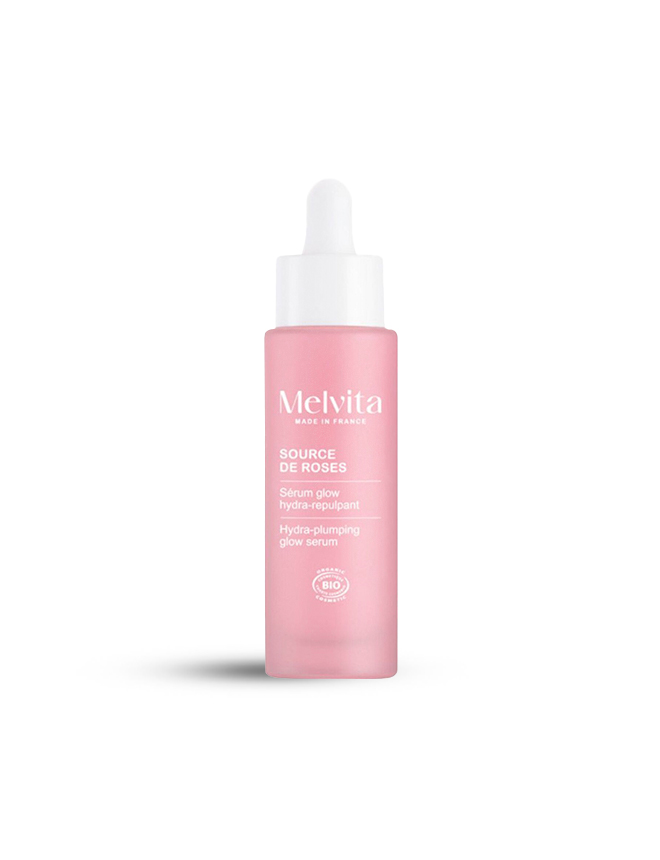
Melvita Source de Roses Serum Glow Hydra-Repulpant shows how colour can create identity without relying on complex geometry. The soft pink treatment covers the bottle while maintaining a muted, almost frosted character, and the white upper component continues the light, gentle palette. White typography is then integrated directly into that coloured surface rather than introducing another strong contrast.
Everything points in the same direction: softness, hydration and sensorial skincare.
The design works because colour is not an additional layer placed over the bottle. It becomes the visual foundation of the entire pack.
Shu Uemura Shimmer Master Sérum uses a similarly restrained structure but creates a very different personality. Its pale muted green surface has a softer, satin-like appearance, while the black dropper and vertical black typography introduce much stronger contrast. The floral graphic becomes visible without overwhelming the glass, giving the bottle a more artistic and professional identity.
These two examples demonstrate how differently a relatively simple bottle can behave once colour and surface treatment are changed.
Melvita uses tonal continuity to create softness.
Shu Uemura uses contrast to give a muted bottle greater graphic intensity.
In both cases, the bottle structure remains relatively quiet so that the colour treatment can define the personality.


Transparency Can Be a Decoration Strategy in Itself
Innovation in decoration does not always mean adding more material or colour.
Sometimes the most effective decision is knowing what not to cover.
Florena Fermented Skin Care Regenerating Facial Oil uses transparency to keep the oil visually present, allowing its natural pale tone to become part of the product identity. The printed graphics and brown upper component provide enough branding to structure the pack without disconnecting the consumer from the formula.
Teaology Bancha Oil pushes this principle even further because the contents themselves create visual complexity. The suspended botanical material gives the bottle texture, movement and colour that conventional decoration would otherwise need to provide.
In packaging like this, opacity would remove one of the strongest assets of the product.
The formula is already doing part of the designer’s work.
This is an important point for innovative cosmetic packaging. Decoration should not automatically mean covering glass. It can also mean deliberately preserving visibility and designing everything else around what the consumer can see inside.
Screen Printing Can Become Part of the Bottle Architecture
Screen printing is especially effective when brands want graphic identity without introducing a separate visual layer such as a label.
Typography and symbols can sit directly on the bottle, allowing the underlying glass treatment or formula to remain part of the composition.
This is clearly visible in Melvita Source de Roses Serum Glow Hydra-Repulpant, where the white text works almost as an extension of the soft pink surface. There is little separation between decoration and bottle; the typography feels integrated into the colour treatment itself.
Shu Uemura Shimmer Master Sérum uses printing differently. The vertical black typography follows the elongated bottle architecture, while the floral illustration adds character without breaking the restrained form. Here, the printed elements help direct the eye along the bottle rather than simply occupying the available front surface.
- This shows why screen printing should be considered alongside bottle proportion.
- A narrow vertical pack invites a very different graphic composition from a wide moulded bottle.
- The printing should respond to the architecture already present in the glass.
- When it does, branding looks integrated rather than applied afterwards.

Hot Stamping Works Best as Controlled Contrast
Hot stamping can introduce a precise metallic highlight without transforming the entire bottle into a reflective surface.
Its strength comes from contrast.
On a matte or translucent bottle, a small metallic detail can immediately attract attention. On a strongly coloured bottle, it can highlight the brand name or a specific graphic element. When the upper component already uses metallic finishes, hot stamping can also create a visual connection between the closure and the body of the pack.
The important point is restraint.
Products such as Lancôme Absolue Precious Oil demonstrate why a limited metallic palette can feel more sophisticated than simply increasing the amount of reflective decoration. The champagne-gold body, refined upper component and exposed clear base already establish a hierarchy; additional metallic accents only need to support that language rather than compete with it.
The same principle applies across innovative packaging.
The strongest decoration techniques are not necessarily those that cover the largest surface.
They are the ones that make the structure, material and dispensing system feel more coherent.
Innovative Decoration Is About Controlling What the Consumer Sees
Looking across these examples, there is no single formula for innovative decoration.
Josie Maran Argan Reserve Concentrate uses a strong metallic surface while preserving a transparent lower section.
Florena Regenerating Facial Oil allows the formula to remain dominant and uses decoration mainly to frame it.
Teaology Bancha Oil lets the botanical contents provide much of the visual complexity.
Lancôme Absolue Precious Oil combines a luminous champagne finish with exposed clear glass to create a softer premium effect.
Melvita Source de Roses uses a unified pink treatment and white graphics to create a gentle, highly coherent identity.
Shu Uemura Shimmer Master Sérum combines a muted glass finish with stronger black graphic contrast.
What changes from one product to another is not simply the technique.
It is what the brand chooses to reveal, conceal, emphasise or subordinate.
That is where decoration becomes genuinely innovative.
It stops being the final cosmetic layer of packaging development and becomes a tool for controlling how the consumer experiences the glass, the formula and the dispensing system as one object.
What Brands Should Ask Before Choosing an Innovative Dispensing System
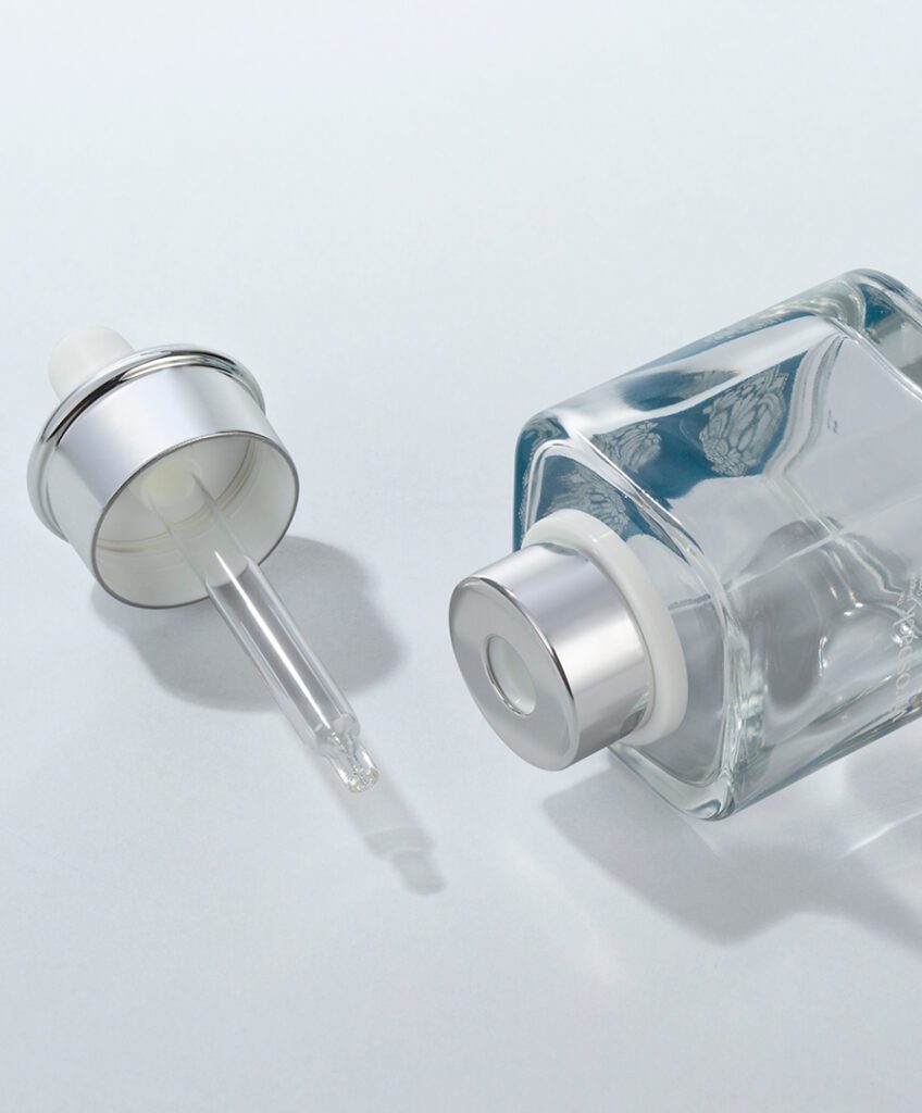
A new mechanism should always answer a clear product need.
For a push button dropper, the central question is whether a more defined and repeatable dispensing gesture improves the formula experience.
For a magnetic dropper, the question is whether tactile closure and alignment genuinely contribute to the prestige and ritual of the product.
The bottle then needs to support that choice physically and visually.
A more substantial moulded glass bottle may reinforce one concept, while a precise tubular bottle may be more coherent with another.
Decoration should follow the same reasoning.
- Should the mechanism become the visual focal point?
- Should it integrate quietly into the bottle?
- Should metallic contrast communicate technology, or would a monochromatic finish better express sophistication?
These decisions turn an innovative component into innovative packaging.
Without them, technology remains just another feature.
The Future of Innovative Cosmetic Packaging Is in the Experience
The evolution of cosmetic packaging is moving towards a more complete understanding of product experience.
Consumers already expect bottles to look attractive.
What increasingly differentiates premium packaging is what happens after they pick the product up.
The push button creates a more structured relationship with dosage.
The magnetic dropper transforms closure into a tactile event.
Moulded glass introduces weight and physical presence.
Tubular glass introduces precision and dimensional clarity.
Decoration determines whether those technologies are emphasised or integrated into a quieter visual language.
These elements show why innovation is becoming less about adding features and more about making every interaction feel intentional.
The next generation of innovative cosmetic packaging will not necessarily look more complicated.
It may look simpler.
But when the consumer touches it, opens it, dispenses the formula and closes it again, the difference should be immediately clear.
Frequently Asked Questions About Innovative Cosmetic Packaging
What is innovative cosmetic packaging?
Innovative cosmetic packaging combines new or advanced functionality with material, design and user experience. Innovation can come from dispensing precision, closure systems, glass construction, decoration or the way these elements work together rather than from appearance alone.
Why are push button droppers considered innovative?
Push button droppers create a more defined dispensing gesture than conventional bulb-operated systems. They can support controlled and repeatable application while also giving skincare, oils and liquid makeup a more technical packaging identity. Virospack currently offers several push-button shapes and dosage configurations for different product requirements.
How do magnetic droppers improve cosmetic packaging?
Magnetic droppers introduce innovation into the closing experience. The magnetic interaction helps guide the upper component into position, creating a more controlled and refined gesture that can be particularly valuable in prestige cosmetic packaging.
What is the difference between moulded and tubular glass in innovative packaging?
Moulded glass offers greater physical presence through thicker bases, weight and defined bottle architecture, while tubular glass offers high transparency, a strong strength-to-weight ratio and greater dimensional flexibility. Both can support innovative dispensing systems but create different product experiences.
Does innovative cosmetic packaging need complex decoration?
No. Advanced mechanisms can work particularly well with restrained decoration. Screen printing, painting, hot stamping and metallization can either highlight the dispensing technology or integrate it quietly into the complete pack. The most effective choice depends on which part of the packaging should carry the strongest visual identity.
Is a more sophisticated dispensing system always better?
No. A dispensing system adds value only when it improves the relationship between formula, dosage and user experience. A push button or magnetic dropper should be selected because it supports the product concept, not simply because the mechanism is more advanced.