

Custom Glass Bottles That Elevate Your Brand: Shapes, Finishes and Decoration Techniques
A custom glass bottle does more than contain a beauty formula.
It gives the product a physical identity.
Before the consumer reads the ingredients, understands the claims or experiences the texture, the bottle has already communicated something about the brand. Its proportions can feel clinical or sensorial. Its weight can suggest luxury. Its transparency can communicate purity. Its colour can imply protection, energy or naturality. Its decoration can make the product instantly recognisable.
This is why customization in cosmetic packaging should never be reduced to placing a logo on a standard bottle.
A truly custom glass bottle is created through several decisions working together: shape, proportion, glass construction, colour, surface finish and decoration.
For skincare, hair care and makeup brands, these decisions determine whether the package feels generic or unmistakably connected to the product inside.
The strongest custom bottles are not necessarily the most complex.
They are the ones where every visual decision has a reason.
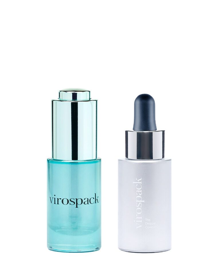
Table of Contents
What Makes a Custom Glass Bottle Truly Custom?
Customization can happen at very different levels.
At its simplest, an existing glass bottle can be transformed through colour, printing or surface finishes. At the other end of the spectrum, the structure of the bottle itself can be developed around a particular shape, proportion or brand identity.
Both approaches can create a distinctive product.
- The important question is not how many elements have been customized.
- It is whether those elements work together.
A bottle may retain a relatively simple cylindrical geometry but become highly recognisable through an unusual gradient, frosted surface and carefully positioned screen printing.
Another product may rely on the opposite strategy: a distinctive glass silhouette with almost no decoration at all.
This distinction matters because successful customization is not about adding more.
It is about deciding where the brand identity should live.
- Sometimes it lives in shape.
- Sometimes in colour.
- Sometimes in material presence.
- Sometimes in the way light moves through the glass.
A custom glass bottle becomes powerful when one clear visual idea controls the entire design.

Shape Is the First Expression of Brand Identity
Shape is understood before colour, typography or decoration.
A consumer can recognise the proportions of a bottle from across a shelf before they can read the logo. This makes geometry one of the strongest tools available in custom glass packaging.
A tall, narrow bottle can feel precise, elegant and technical.
A wider bottle can communicate stability and physical presence.
Rounded shoulders may create softness and sensoriality.
Sharper transitions can make the pack feel more architectural or contemporary.
A thick base can give even a relatively simple shape a greater sense of substance.
These decisions are not theoretical. They are visible in very different ways across premium beauty packaging.
Vichy Minéral 89 Probiotic Fractions Concentrate uses a compact bottle with a broader lower section and narrower shoulders, creating a stable, recognisable silhouette. The shape feels controlled and treatment-oriented rather than decorative, which supports the product’s technical skincare positioning.
YSL Forever Youth Liberator Serum relies much more heavily on verticality. Its tall, slender body creates elegance through proportion. The bottle feels elongated and refined before the gradient or branding is even considered, showing how a relatively simple silhouette can still create a strong luxury identity.


La Mer Genaissance Serum Essence moves in the opposite direction. Its rounded, sculptural body, pronounced shoulders and substantial base give the bottle a much more physical presence. Here, the glass shape itself becomes a major part of the luxury experience, making the pack feel more like an object than a neutral container.
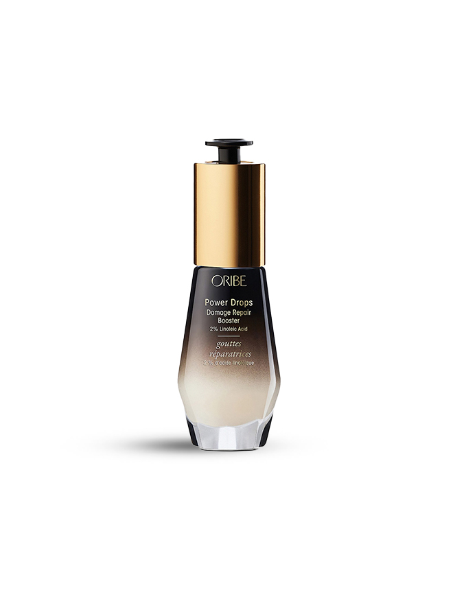
Oribe Power Drops uses a compact, tapered geometry with clear transitions between the lower body and the narrower upper section. This creates a more architectural silhouette that feels deliberate and recognisable, even before the metallic upper component and dark finish are added.
Redken Diamond Oil Shatterproof Shine shows how structural geometry can become even more expressive. Its elongated bottle uses faceted surfaces that interact with light and create a strong visual signature. In this case, the bottle shape is not simply a container for the formula; it becomes part of the product’s identity.
These examples show why shape should be considered before decoration.
A bottle can already communicate a great deal through proportion alone.
Vichy feels compact and technical.
YSL feels vertical and elegant.
La Mer feels sculptural and substantial.
Oribe feels structured and contemporary.
Redken feels dynamic and faceted.
None of these effects depend first on a logo.
They come from the architecture of the glass.
The shape of a custom glass bottle should therefore answer a brand question before it answers an aesthetic one:
What should this product feel like before it is opened?
Moulded Glass Bottles for Sculptural Shape and Physical Presence
When shape itself needs to become an important part of the brand identity, moulded glass bottles offer significant possibilities.
Moulded glass naturally allows a bottle to develop more physical character through its silhouette, shoulders, base and overall proportions. A thicker glass base can also add weight and presence, changing not only how the pack looks but how it feels when picked up.
Virospack’s moulded glass range is built around this principle, with Wide and Slim bottle architectures and thick glass bases designed to add weight and presence. The bottles can also be customized through different decoration and finishing techniques.
This type of construction is particularly relevant when a brand wants the container to feel like an object rather than simply a vessel.
The luxury effect does not necessarily require an extravagant silhouette.
A restrained bottle with carefully controlled proportions, a substantial base and a refined surface treatment can feel more sophisticated than a highly complex shape.
This is where moulded glass becomes interesting for customization.
The brand can use the structure itself to create identity.
The bottle may appear wider and grounded.
It may become slimmer and more vertical.
The shoulders may become part of the signature.
The base can visually anchor the formula.
The relationship between transparent glass and thicker areas can create optical effects even before any decoration is added.
For brands seeking stronger shelf recognition, moulded glass allows the bottle architecture itself to participate in branding.
Droppers Catalogue
Discover our full range of droppers catalogue
Tubular Glass Bottles for Precision and Dimensional Flexibility
Not every custom glass bottle needs a sculptural shape.
For many modern beauty brands, precision is more powerful than complexity.
This is where tubular glass bottles offer a very different customization strategy.
Tubular glass is characterised by clean geometry, dimensional consistency and an excellent strength-to-weight ratio. Virospack also highlights the ability to adapt height, diameter and neck configuration to different requirements, while its current tubular range is highly customizable through decoration and can be adapted to different sizes without investment in a dedicated mould.
That changes the meaning of customization.
Instead of building brand recognition through sculpted glass, tubular bottles can create identity through proportion.
- A few millimetres in diameter.
- A taller or shorter body.
- A different relationship between bottle height and neck.
- A compact format.
- A more elongated silhouette.
These apparently subtle decisions can significantly change how a bottle is perceived.

For skincare brands built around science, ingredients or precision, this visual discipline can be extremely effective. The bottle can remain simple while still feeling proprietary because its dimensions, colour and decoration have been carefully controlled.
Tubular glass therefore offers an important lesson in custom packaging:
- distinctiveness does not always require complexity.
- Sometimes a perfectly proportioned simple bottle is the stronger design.
Proportion Matters as Much as Shape
Brands often focus on silhouette when discussing a custom glass bottle, but proportion can be just as important.
Two bottles can share relatively simple geometric principles and still create completely different identities depending on the relationship between width, height, shoulders, neck, base and closure.
- A tall, narrow bottle can communicate precision and technical performance.
- A wide, compact bottle can feel more sensorial and distinctive.
- A small body paired with a visually dominant closure can immediately emphasise function.
Real packaging shows how strongly these relationships influence perception.
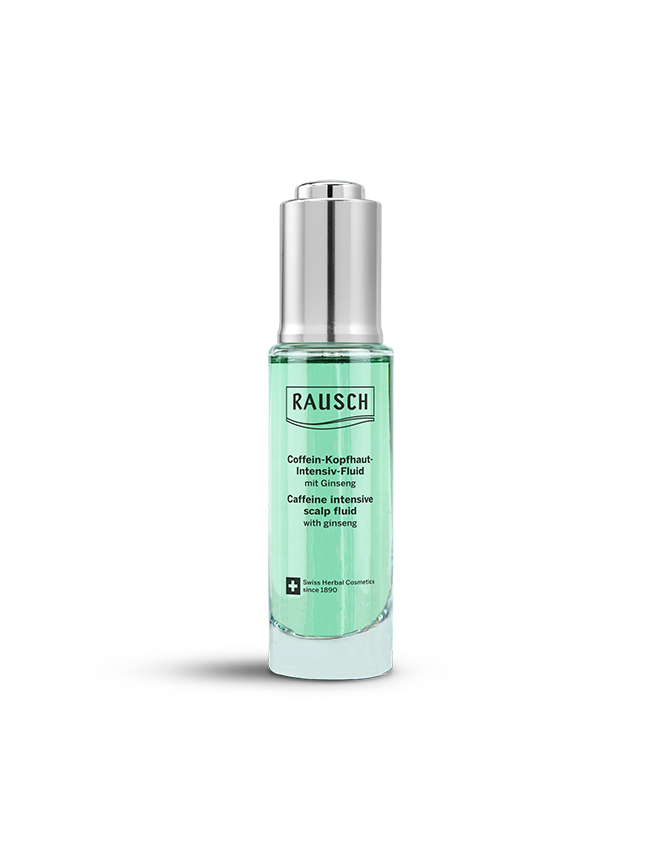
Rausch Intensiv Scalp Fluid is built around verticality. Its body is tall, narrow and almost continuous in diameter from the glass to the metallic upper component. The transparent glass exposes the green formula, while the substantial clear base gives the bottle visual stability. The result is precise and treatment-oriented: the proportions immediately suggest a product designed for controlled scalp application rather than conventional hair care.
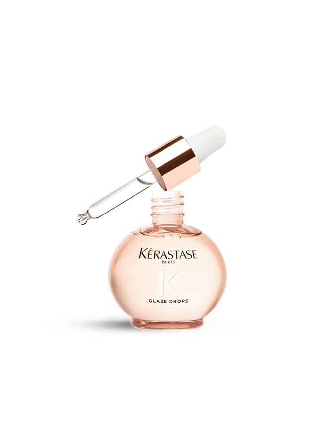
Kérastase Glaze Drops takes almost the opposite approach. Its glass body is extremely broad and rounded in relation to its height, creating a compact, almost spherical silhouette. The neck is comparatively narrow, which exaggerates the width of the bottle even further. Combined with the pale pink glass and rose-gold dropper collar, these proportions make the product feel more sensorial, cosmetic and object-like. The bottle does not communicate precision through verticality; it communicates desirability through volume and softness.

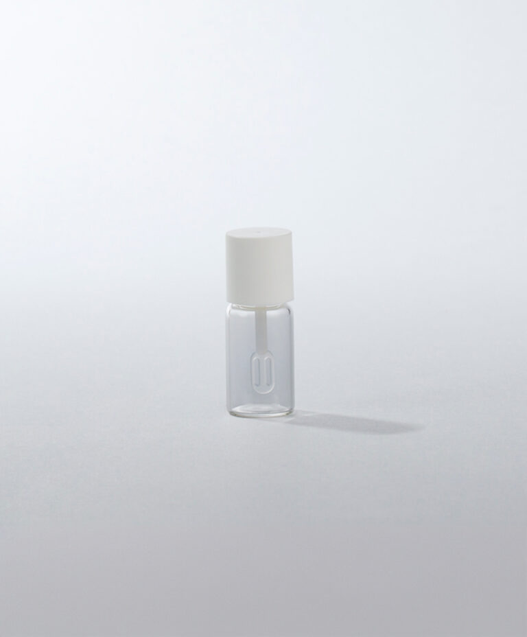
Bourjois Instant Dry demonstrates a third approach. Its clear glass body is short and compact, with a broad base that tapers progressively towards a much narrower neck. The black dropper closure occupies a large proportion of the total pack height, making the applicator visually important. This balance immediately communicates function: the bottle feels like a specialised treatment product designed around a precise dispensing gesture rather than simply a miniature glass container.
The three products therefore use proportion in very different ways.
- Rausch creates identity through a tall, narrow and continuous vertical structure.
- Kérastase uses an unusually wide, rounded body to create softness and sensorial presence.
- Bourjois combines a compact tapered bottle with a prominent closure to make functionality part of the visual identity.
This is why proportion should be considered alongside shape from the beginning of custom glass bottle development.
It also determines how every later design decision behaves.
A large logo may work naturally across the broad front of a rounded bottle but overwhelm a narrow vertical format.
A tall bottle can use typography to reinforce verticality.
A wide bottle can use negative space to emphasise its horizontal proportions.
The closure itself can either continue the architecture of the bottle, as in Rausch, or deliberately contrast with it, as in Kérastase and Bourjois.
Shape defines the architecture of the bottle. Proportion determines its personality.
Finishes Can Transform the Same Glass Bottle
Customization does not always require changing the structure of the bottle.
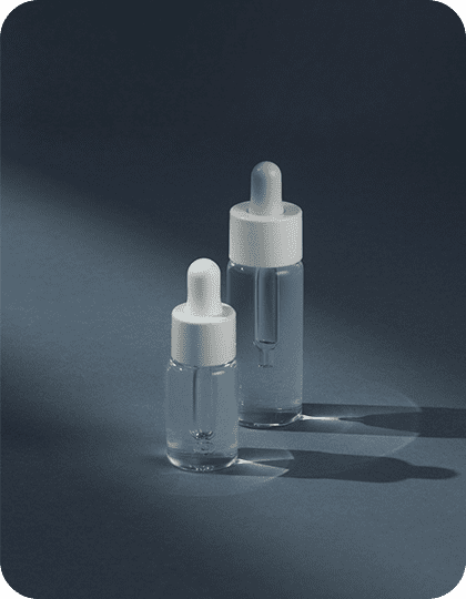
Surface finish can completely transform the identity of the same glass geometry.
A transparent bottle feels different from a frosted version.
The same bottle in an opaque colour becomes a different object again.
Add translucency, pearl effects or a gradient and the visual language changes once more.
Virospack’s in-house glass decoration capabilities include opaque and translucent colours as well as bright and matte finishes. Its tubular glass documentation also lists effects such as frosted, opaque, opalescent, semi-transparent, pearly and gradient finishes.
This flexibility allows brands to use surface treatment as an integral part of their positioning.
Clear and translucent finishes
Clear glass puts the formula at the centre of the design.
It works especially well when the liquid itself contributes visual value through colour, texture or movement.
A translucent finish creates a different relationship with the product. The formula remains partially visible, but the surface introduces more control and visual depth.
This can be particularly effective when a brand wants transparency without making the packaging feel completely exposed.
Frosted and matte finishes
Frosting changes the way light interacts with the bottle.
Reflections become softer.
The glass feels visually quieter.
The formula becomes less literal.
This can create a more refined, sensorial or minimalist identity without changing the bottle shape.
A matte treatment can push that restraint further, especially when the design depends on subtle typography and limited colour.


Opaque finishes
Opaque coatings allow the bottle to become a solid brand colour rather than simply a transparent container.
This can create strong recognition across a range and give brands much greater control over how the product appears on shelf, in photography and online.
Opacity can also visually simplify the bottle by removing the formula from the design equation.
The consumer sees the brand first.
Gradient finishes
Gradients introduce movement.
A bottle can transition from dark to clear, opaque to translucent or one colour into another.
Unlike a flat colour, a gradient uses the bottle’s height as part of the design.
It can suggest radiance, transformation, concentration or movement depending on how it is executed.
This makes gradients particularly effective when the packaging needs to communicate an idea rather than simply reproduce a corporate colour.
Colour Should Build Recognition, Not Simply Follow Trends
Colour is one of the fastest ways to transform a custom glass bottle.
But choosing a colour because it is fashionable rarely creates a strong long-term identity.
The most effective colour strategies connect the bottle with the personality of the formula and the positioning of the brand.
- Dark tones can create depth and intensity.
- Soft neutral shades can support restraint and contemporary minimalism.
- Warm tones may reinforce nourishment or sensoriality.
- Cool tones can create a more technical or fresh identity.
- Bold colours can make a product instantly recognisable in a crowded category.
- But consistency matters as much as the colour itself.
If a brand develops several products, the relationship between shades, opacity levels and decoration can become a visual system across the range.
The bottle no longer identifies only one SKU.
It identifies the brand.
That is where custom colour becomes strategically valuable.
Screen Printing: Branding Directly on the Glass
Screen printing is one of the most versatile decoration techniques for custom glass bottles.
It allows logos, typography, symbols or other graphic elements to become part of the surface rather than relying on a separate label.
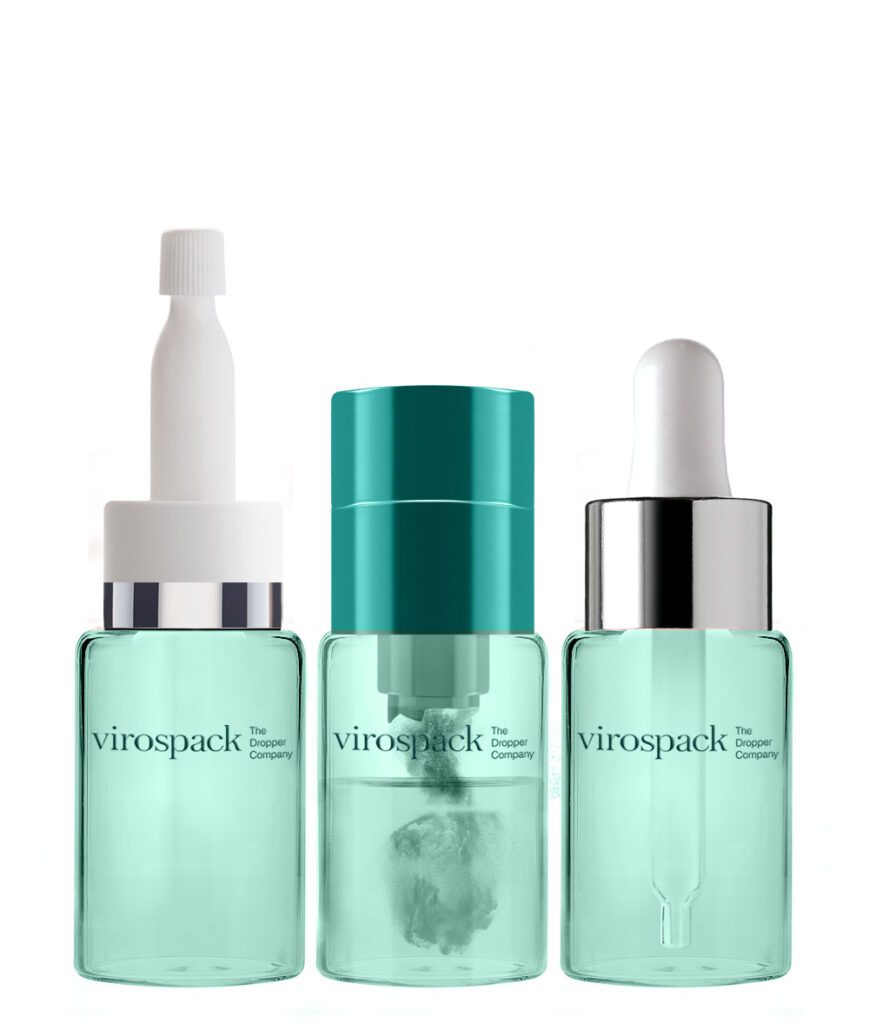
Virospack’s in-house screen-printing capabilities include one-, two- and three-colour applications, alongside other decoration processes.
For beauty packaging, the advantage is visual integration.
Typography can appear to belong to the bottle.
The glass remains visible around it.
The design can remain minimal while still carrying the necessary brand information.
Screen printing works particularly well when the bottle itself already has a strong finish or colour.
A small amount of carefully positioned typography can be enough.
This is also where restraint becomes important.
More printed information does not automatically create a more customized pack.
Sometimes one precise logo on a carefully chosen surface creates more identity than covering the entire bottle.
The effectiveness comes from composition.
Hot Stamping for Controlled Metallic Accents

Hot stamping introduces reflective detail without requiring the entire bottle to become metallic.
This makes it especially effective when the objective is contrast.
- A metallic logo.
- A fine border.
- A small typographic detail.
- A single visual accent.
Virospack integrates hot stamping into its decoration capabilities for glass packaging.
The technique can add a sense of precision and luxury because it responds strongly to light.
But its power comes from scarcity.
If everything reflects, nothing feels special.
A carefully positioned metallic element can draw the eye towards the brand name or a specific part of the bottle while allowing the glass finish to remain dominant.
For custom glass bottles, hot stamping is often strongest when used as punctuation rather than as the entire sentence.

Metallization for a More Transformative Finish
Metallization changes the character of glass more dramatically.
Instead of simply adding a metallic detail, it can make larger areas of the pack appear reflective and highly finished.
Virospack operates in-house metallization capabilities, and metallization is included among the customization options documented for its tubular glass packaging.
This opens a different design territory.
Glass can move away from transparency and begin to behave visually more like a polished object.
Metallic surfaces can communicate technology, luminosity, prestige or futuristic precision depending on colour and intensity.
However, this type of finish needs to be considered carefully.
A strong metallic surface can dominate the bottle.
If the brand identity already relies on a distinctive shape, elaborate colour and complex typography, adding another highly expressive treatment may create visual competition.
The most successful customization usually establishes hierarchy.
One feature leads.
The others support it.
The Best Custom Glass Bottles Combine Shape, Finish and Decoration
Shape, finish and decoration should not be designed independently.
They should reinforce one another.
Imagine a simple tubular bottle.
- Left completely clear, it can feel precise and transparent.
- Give it a frosted finish and it becomes softer.
- Apply an opaque colour and it becomes more graphic.
- Introduce a gradient and it gains movement.
- Add fine screen printing and the identity becomes more controlled.
- Introduce a metallic hot-stamped detail and the same simple bottle can move into a premium territory.
The geometry has not changed.
The brand perception has.
The same principle applies to moulded glass.
A strong silhouette may already provide enough identity. In that case, decoration can remain minimal.
The bottle itself becomes the hero.
This is why customization should begin by deciding what element carries the strongest brand signal.
- Is it the shape?
- The glass colour?
- The surface?
- The typography?
- The metallic detail?
Once that decision is clear, the rest of the design can support it.

Moulded or Tubular Glass: Which Is Better for Customization?


The answer depends on what the brand wants to customize.
If the priority is structural presence, moulded glass is often the more natural starting point.
It allows the physical character of the bottle—its base, silhouette, shoulders and overall weight—to become an important part of the identity. Virospack’s moulded range specifically emphasises thick bases, weight and presence alongside extensive finishing options.
If the priority is dimensional flexibility and surface identity, tubular glass offers a different advantage.
Its height and diameter can be adapted more flexibly, and Virospack states that custom sizes can be developed without mould investment. Its smooth, calibrated surface also supports multiple decoration processes.
Neither approach is inherently more custom.
They simply create customization in different ways.
Moulded glass can make structure the signature.
Tubular glass can make proportion and decoration the signature.
A brand should decide which of those languages is closer to the product it wants to create.
Custom Does Not Mean Overdesigned
One of the easiest mistakes in custom packaging is trying to demonstrate customization everywhere.
- A distinctive bottle shape.
- A complex gradient.
- Multiple colours.
- Metallic decoration.
- Large typography.
- Several surface effects.
Each element may be attractive individually, but together they can weaken the design.
A custom glass bottle should feel specific, not busy.
Strong brands usually create recognition through a limited number of controlled signals.
Perhaps the bottle shape is proprietary and the decoration is almost invisible.
Perhaps the bottle is structurally simple but uses a colour that becomes inseparable from the brand.
Perhaps the surface is frosted and the only decoration is a small metallic logo.
Customization works when the consumer remembers something.
That memory becomes much harder to create when every part of the bottle competes for attention.

From Design Concept to a Bottle That Can Be Produced Consistently
A custom glass bottle ultimately has to exist beyond the rendering.
Colour must remain consistent.
Printing must sit correctly on the bottle.
Gradients must reproduce reliably.
The chosen finish must work across the required production volume.
Decoration must remain compatible with the intended product and use conditions.
This is why technical development matters as much as creativity.
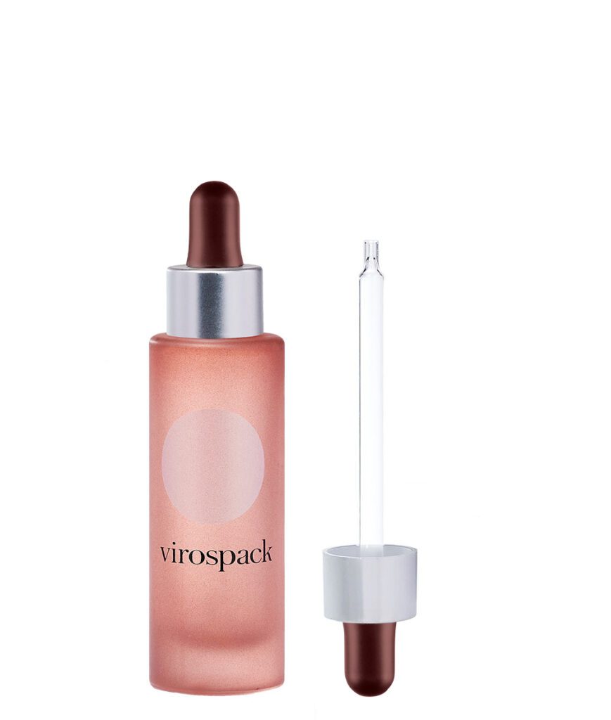
Virospack manufactures tubular glass and carries out multiple decoration processes in-house, including painting, screen printing, hot stamping and metallization. Its moulded bottles are also designed to support extensive customization through in-house finishing techniques.
For brands, this creates an important distinction between a design that looks custom and a bottle that can actually function as a repeatable brand asset.
The goal is not one perfect prototype.
It is a visual identity that can remain consistent from production run to production run.
How a Custom Glass Bottle Elevates a Beauty Brand
A custom glass bottle elevates a brand when it makes the product more recognisable, more coherent and more valuable before the formula is even used.
- Shape creates recognition.
- Proportion creates character.
- Glass construction creates physical presence.
- Colour establishes identity.
- Finish changes how the bottle interacts with light.
- Decoration determines where the eye goes.
The strongest packaging brings these elements together without making the consumer consciously analyse them.
The bottle simply feels right for the product.
That is the real objective of customization.
Not to prove that every component can be modified.
But to create a package that could not convincingly belong to another brand.
For some products, that may mean the sculptural presence of a moulded glass bottle.
For others, it may mean the dimensional precision and decoration flexibility of a tubular glass bottle.
Both can become highly distinctive.
What matters is how deliberately the glass is used as part of the brand identity.

Frequently Asked Questions About Custom Glass Bottles
What is a custom glass bottle?
A custom glass bottle is a bottle whose shape, dimensions, colour, finish or decoration has been adapted to support a specific product and brand identity. Customization can range from surface decoration on an existing bottle to more distinctive structural development.
What can be customized on a glass bottle?
Brands can customize elements such as bottle proportions, colour, opacity, frosting, matte or glossy finishes, gradients, screen printing, hot stamping and metallized effects. The available options depend on the glass construction and production requirements.
What is the difference between moulded and tubular custom glass bottles?
Moulded glass bottles are particularly effective when weight, base design and structural presence are central to the packaging identity. Tubular glass bottles offer clean geometry and greater flexibility in dimensions, with Virospack noting that different sizes can be adapted without investment in moulds.
Can a standard glass shape still look custom?
Yes. A structurally simple bottle can become highly distinctive through proportion, custom colour, frosting, gradients, printing or metallic decoration. Custom packaging does not require a complicated shape if the visual identity is strong and consistent.
Which decoration techniques work well for custom glass bottles?
Screen printing, painting or lacquering, hot stamping, metallization and custom colour finishes can all be used to create distinctive glass packaging. The right technique depends on whether the brand wants transparency, softness, strong colour, metallic contrast or a more graphic identity.