

Blue Dropper Bottle: Premium Packaging for Serums, Oils and Active Skincare
A blue dropper bottle does more than hold a cosmetic formula.
In skincare packaging, colour influences how the product is perceived, how the formula is positioned and how the overall user experience is communicated before the product is even used.
This is particularly true in premium serums, facial oils and active skincare treatments, where packaging is expected to support both performance and brand identity.
The popularity of the blue dropper bottle is not accidental. It reflects a combination of visual positioning, technical perception and compatibility with formulations that require controlled application.
Table of Contents
Why Blue Dropper Bottles Are So Common in Skincare
Certain colours have become strongly associated with specific product categories.
Blue is frequently used in skincare because it naturally communicates hydration, freshness, purity and technical performance.
Unlike warmer colours that often emphasize natural ingredients or sensorial experiences, blue tends to reinforce a more treatment-oriented perception. This makes blue dropper bottles particularly suitable for products positioned around efficacy, skin health and active ingredients.
The colour itself becomes part of the communication strategy, helping consumers immediately identify the product as something designed to support skincare performance rather than simple cosmetic enhancement.
The Psychology Behind Blue Packaging
Colour plays an important role in how consumers interpret cosmetic products.
Blue is often associated with trust, stability, cleanliness, precision and reliability. These associations align naturally with the objectives of many skincare formulations.
However, not all blue packaging communicates the same message.
Products such as Biotherm Blue Therapy Serum demonstrate how colour intensity and finishing techniques can influence perception. The dark-to-light blue gradient creates visual depth while reinforcing associations with repair, hydration and advanced skincare technology. Combined with a metallic dispensing system, the packaging communicates both efficacy and sophistication.
The result is a visual identity that feels reassuring, technical and premium at the same time.

Why Blue Works Particularly Well with Active Skincare
Many active skincare products rely on a perception of efficacy and precision.
The packaging must communicate that the formulation is designed to deliver results through controlled and consistent application.
Blue packaging naturally supports this positioning because it is often associated with science-driven skincare and performance-oriented products.
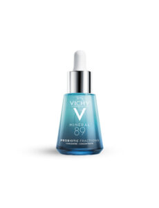
This can be seen in products such as Vichy Minéral 89 Probiotic Fractions Concentrate, where the blue-tinted glass works together with a dropper system and treatment-oriented bottle geometry to reinforce perceptions of hydration, skin barrier support and technical skincare performance.
The packaging does not rely on decorative elements. Instead, colour, structure and controlled dispensing all contribute to a message of efficacy and daily treatment.
How Blue Glass Changes Formula Perception
The same formula can be perceived differently depending on the packaging that surrounds it.
Blue glass changes how consumers interpret the product by shifting attention toward performance rather than indulgence.
Different brands use this visual language in different ways.
In Horace Salicylic Niacinamide, the deep cobalt blue bottle reinforces a clinical and ingredient-focused identity that aligns naturally with active skincare positioning. The dark glass, monochromatic colour palette and integrated dropper system create a strong perception of treatment and correction.
By contrast, Naturopathica Inspire Aromatic Alchemy uses blue glass within a softer and more sensorial packaging system. Here, the colour supports a perception of wellbeing, ritual and emotional experience while still maintaining an association with product quality.
Although both products use blue packaging, they communicate very different relationships with the formula.


Droppers Catalogue
Discover our full range of droppers catalogue
Blue Glass vs Clear Glass: What Changes?
The difference between blue glass and clear glass extends beyond colour.
Clear glass prioritizes visibility. It allows consumers to fully observe the texture, movement and colour of the formula inside the bottle.
Blue glass introduces a layer of interpretation between the consumer and the product.
This balance can be observed in products such as Free Agent Lightspeed Hydra Glow C Serum, where the translucent blue glass preserves partial visibility of the formulation while simultaneously creating a stronger visual identity than fully transparent packaging.
Rather than choosing between visibility and positioning, this approach allows brands to benefit from both.
The consumer can still perceive the formula while the packaging communicates a more distinctive brand identity.


Can Blue Glass Help Protect Cosmetic Formulas?
Blue glass is often associated with product protection, but its role should be understood correctly.
The colour can help reduce certain light transmission levels compared with completely transparent packaging, but protection depends on multiple variables including glass composition, colour intensity, wall thickness and storage conditions.
The relationship between blue packaging and preservation can be observed in ranges such as Kiehl’s Midnight Recovery Concentrate, where deep blue glass is used consistently across multiple bottle sizes. The visual identity immediately suggests concentration, care and formula preservation, particularly within an oil-based treatment range.
While colour alone does not determine protective performance, darker glass can contribute to a packaging strategy designed around product stability and premium positioning.
Why Blue Packaging Works Well with Different Dispensing Systems
The versatility of blue glass packaging goes beyond the bottle itself.
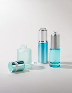
One of its strengths is its ability to integrate with a wide variety of dispensing systems while maintaining a consistent visual identity.
This flexibility allows brands to adapt the packaging experience to the behaviour of the formula rather than forcing every product into the same application logic.
For products that require precise and progressive application, standard droppers remain one of the most widely used solutions. They encourage controlled dosing and create an interaction centred on precision and personalization.
For formulations where repeatability and dosing consistency are priorities, push button droppers can introduce a more engineered dispensing experience. By regulating the dispensing cycle more consistently, they help create a stronger perception of control and technical performance.
In products designed for targeted application, roll-on systems offer a completely different interaction. Instead of dispensing drops into the hand, the formula is applied directly to the skin through the rolling applicator, creating a more immediate and localized experience.
Some premium skincare brands also explore more sophisticated solutions such as magnetic droppers, where the closure itself becomes part of the luxury experience. These systems combine controlled dispensing with enhanced ergonomics and a more distinctive opening and closing ritual.
The blue bottle acts as a versatile foundation across all these solutions.
Whether combined with a standard dropper, a push button system, a roll-on applicator or a magnetic closure, the visual language remains strongly associated with efficacy, hydration and treatment-oriented skincare.
This ability to support multiple dispensing experiences while preserving a coherent product identity is one of the reasons blue glass remains such a popular choice in premium cosmetic packaging.

Glass Construction and Its Impact on Blue Dropper Bottles
The visual effect of blue packaging is influenced not only by colour, but also by bottle construction.
The structure of the glass affects how the product feels in hand, how light interacts with the surface and how the packaging is perceived overall.
This becomes particularly evident in product families such as Kiehl’s Midnight Recovery Concentrate, where the same blue glass identity is maintained across multiple formats. The consistency of colour, geometry and dispensing systems creates a coherent experience regardless of bottle size.
In smaller formats such as Horace Salicylic Niacinamide, the combination of deep blue glass and a simplified silhouette creates a stronger treatment-oriented perception, demonstrating how structure and colour work together to define product identity.
Depending on the desired positioning, brands may choose between:
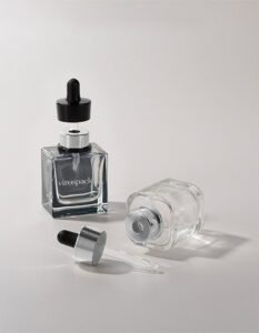
- Tubular glass bottles, which typically provide lighter and more uniform structures.
- Moulded glass bottles, which allow thicker bases, sculpted geometries and a stronger physical presence.
These decisions influence far more than appearance. They shape the entire perception of the product.
When a Blue Dropper Bottle Is the Right Choice
A blue dropper bottle is particularly effective when the objective is to communicate:
- hydration
- technical performance
- skincare expertise
- controlled application
- formulation credibility
It works especially well for products positioned around active ingredients, efficacy-driven skincare and treatment-oriented routines.
The most successful examples demonstrate that colour alone is never responsible for product perception. Instead, the strongest packaging systems combine colour, glass construction, dispensing mechanisms and formulation positioning into a single coherent experience.
When these elements work together, the blue dropper bottle becomes much more than a container. It becomes part of how the product communicates its purpose before the formula is ever applied.
FAQs About Blue Dropper Bottles
What are blue dropper bottles commonly used for?
They are commonly used for serums, facial oils, active skincare treatments and concentrated cosmetic formulations that benefit from controlled dispensing.
Why is blue often used in skincare packaging?
Blue is frequently associated with hydration, purity, trust, technical performance and science-driven skincare.
Does blue glass protect cosmetic formulas?
Blue glass can reduce certain light transmission levels compared with clear glass, but overall protection depends on the complete packaging system and the specific requirements of the formula.
Are blue dropper bottles suitable for active skincare?
Yes. Blue packaging is often used to reinforce perceptions of efficacy, precision and treatment-oriented skincare, making it particularly suitable for active formulations.
What is the advantage of combining blue glass with a dropper system?
Both elements support controlled application and reinforce a product positioning centred on precision, performance and progressive use.